The RIA Document Fulfillment (DF) tool is a framework used for generating PDFs
from XML files. It supports online PDF generation, document store
configuration, user management, template configuration, etc.
With this tool, you can also store the generated PDF files in either a
database or any third-party Document Management System. DF is built using a
set of open-source technologies that are containerized for easy deployment.
Additionally, it can be integrated with external systems like
Oracle Revenue Management and Billing (ORMB) and Oracle Customer Care &
Billing (CC&B).
An application is a microservice that makes a product.
Every application can have a group of supported endpoints and fields. They form the basis for the following privilege-based access controls:
Services — manages API endpoints utilized by the applications.
Fields — manages form controls on the user interface of a product.
Menu items — manages menu options displayed in the left navigation of a product.
It is essential to ensure that each microservice or application is well-designed, maintained, and tested to ensure that it functions flawlessly with the other components of the product.
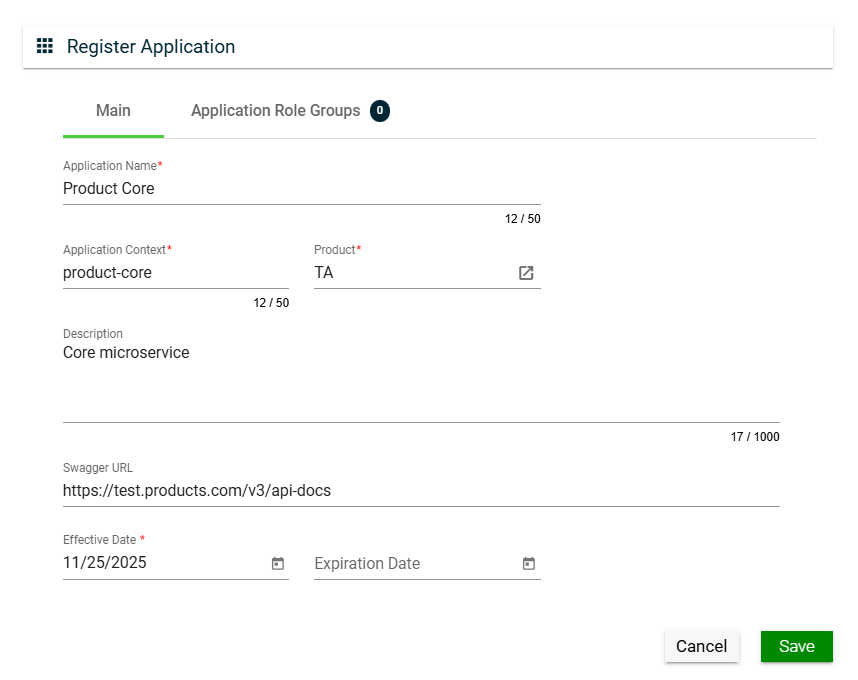
Create an application
To create an application, click Create New and enter valid values in the following fields:
Field
Description
Application Name
Name of the application.
Mandatory: Yes
Application Context
Pre-defined application context.
Mandatory: Yes
Product
Product under which the application is registered.
Only the active products in the Products page are displayed in the dropdown list.
Mandatory: Yes
Description
Description of the application.
Mandatory: No
Swagger URL
Swagger URL where fields and services are registered.
Mandatory: No
Effective Date
Date when the application will be available.
Mandatory: Yes
Expiration Date
Date when the application will no longer be avaialble.
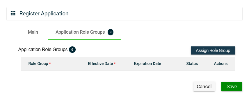
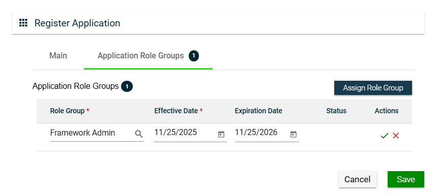
To assign a role group to your application, follow these steps:
Click the Assign Role Group button.
Search for an available Role Group. To configure a role group, see Role Groups.
Set the Effective Date.
Set the Expiration Date.
To save, click .
To cancel the role group assignment, click .
To assign another role group, follow the steps above.
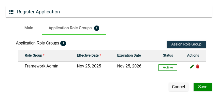
To edit a role group, click and make the necessary changes.
To delete a role group, click .
Views
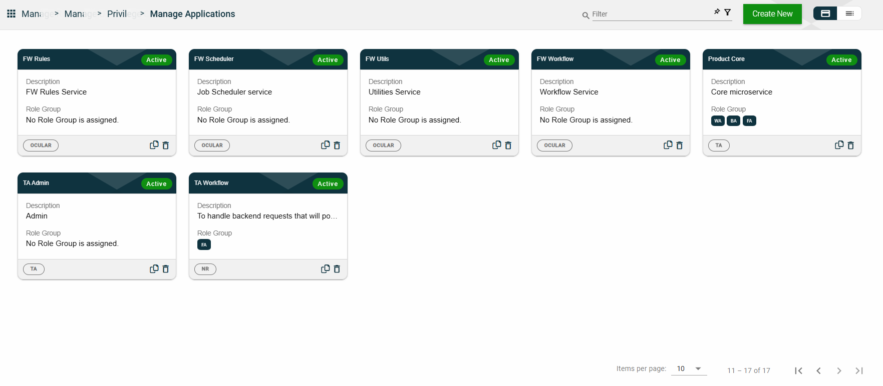
Card View
The card view presents all applications in the form of cards, with the application name and status on the card header. The card displays the Description, Role Group, and the configured authentication type. The card footer displays the product associated with the application, a duplicate icon, and a delete icon.
Clicking anywhere on the card, except the duplicate and trash icons, will redirect you to view the Application Details.
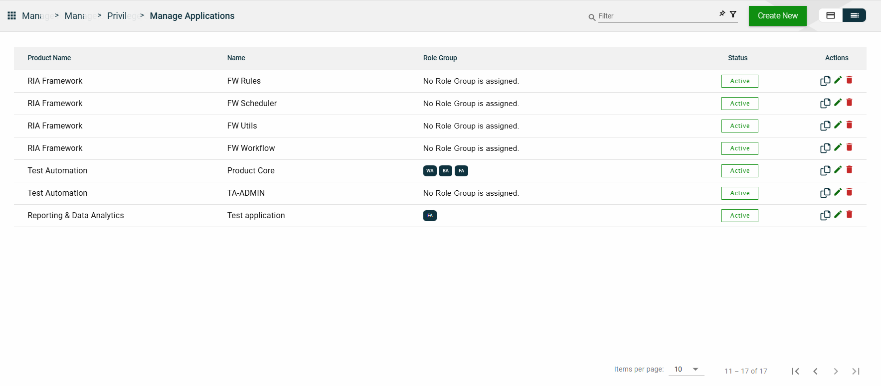
List View
The list view displays all applications in a table format, listing all configured applications in the framework.
Column Name
Description
Product Name
Product under which the application is registered.
Name
Name of the application.
Role Group
Role groups assigned to the application.
Status
Status of the application.
Actions
Displays the following icons:
— Clone icon that allows you to clone the selected dataset. When clicked, a popup window is displayed asking you to provide a new Application Name and Application Context. All other configurations of the selected dataset are copied.
— Edit icon that allows you to edit the application details.
— Delete icon that allows you to delete the selected application.
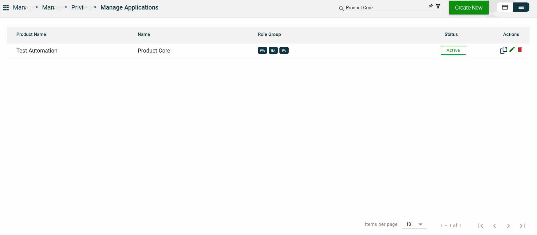
Filter
The following filters are available on both card and list views:
Application Name
Context
Effective Date
Product
Status
You can enter a keyword or the full value of any of the parameters listed above. For example,
Sort
The following columns on the list view can be sorted:
Product Name
Name
Status
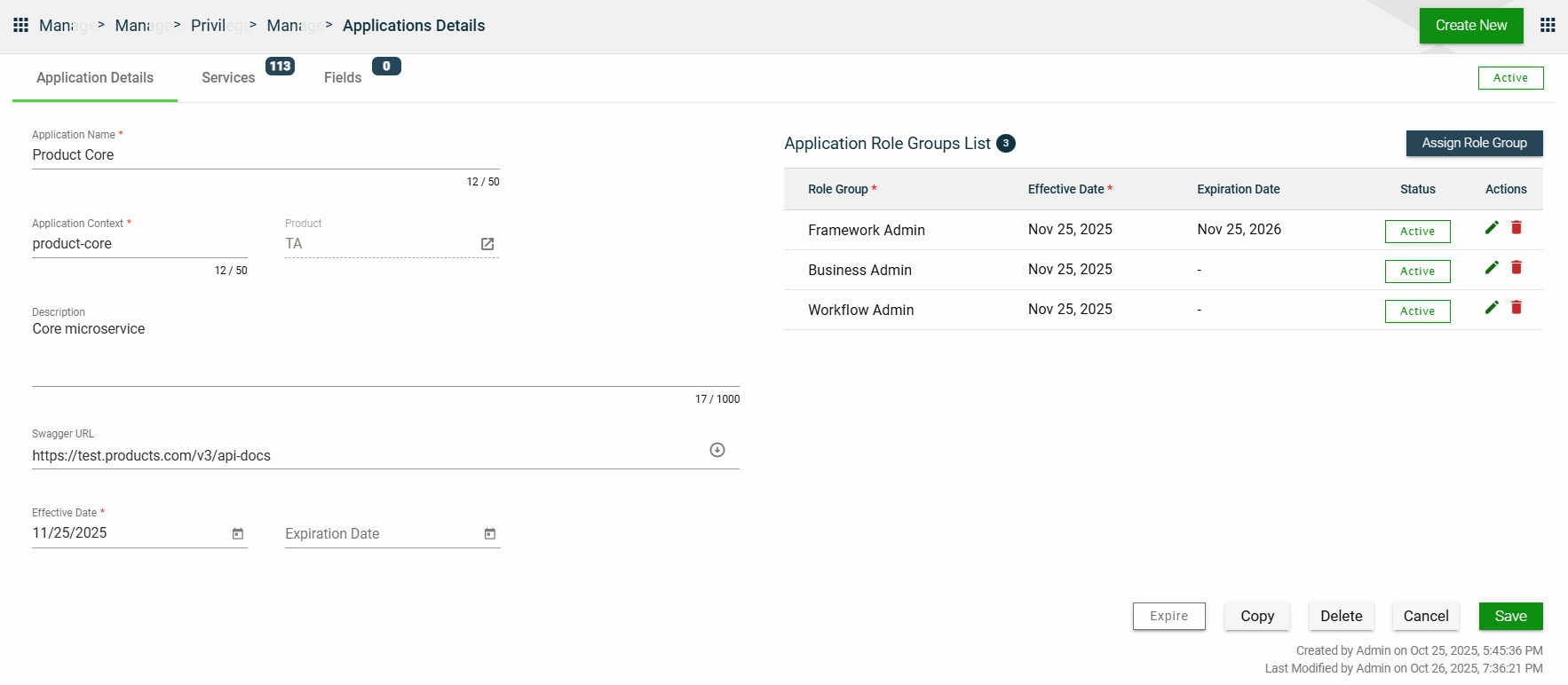
Application Details
Application Details
The Application Details tab shows all the information you added when creating your application. For more information about the fields, see Create an Application.
You can also add more role groups or modify the existing ones by following the same steps in the Application Role Group.
This tab allows you to update all the fields except for the Product. Additionally, you can choose to expire, copy, or delete the selected application from this tab.
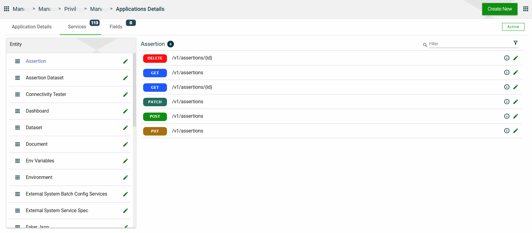
Services
The Services tab lists all configured services for the selected application. The services are grouped according to the entity to which they belong.
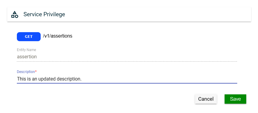
In this section, you can only edit the Entity Name field of an entity and the Description field of a service by clicking the icon next to the item.
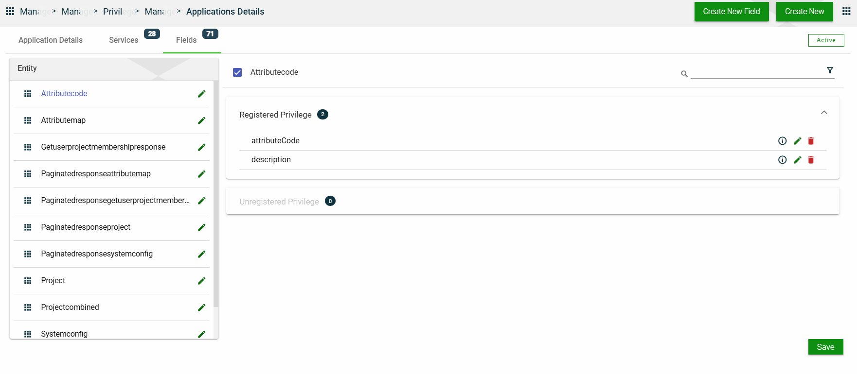
Fields
The Fields tab lists all configured fields for the selected application. The fields are grouped according to the entity to which they belong, and further grouped in the following categories within each entity:
Registered Privilege
Unregistered Privilege
In this section, you can only edit the Entity Name field of an entity and the Description field of a field privilege by clicking the icon next to the item. You can also delete a field privilege by clicking .
1.2 - Organizations
Overview
The Organization represents the legal entity in the RIA Framework.
The Organization module allows you to configure your SMTP to facilitate email notifications. Additionally, you can also configure authentication mechanisms, such as basic authentication and OAuth 2.0.
You can add multiple users to your organization. To learn more about users, see Users.
Create an organization
To create an organization, click Create New and enter valid values in the following fields:
Field
Description
Name
Name of the organization.
Mandatory: Yes
Organization Type
Type of the organization. The following are the possible values:
Product Owner — An organization providing services.
Client Organization — An entity representing the end customers.
Mandatory: Yes
Organization Email
Official email address of the organization.
Mandatory: Yes
Company Code
Code of the company used for auditing purposes.
Mandatory: No
Description
Additional details of the organization.
Mandatory: No
Effective Date
Date when the organization will be available.
Mandatory: Yes
Expiration Date
Date when the organization will no longer be available.
Mandatory: No
Locale
Primary language used in the ogranization.
Mandatory: Yes
Country
Country of origin of the organization.
Mandatory: Yes
Time Zone
Primary time zone used in the organization.
Mandatory: Yes
Views
Card View
The card view presents all applications in the form of cards, with the organization name and its status on the card header. The card displays the Organization Email and Organization Type. The card footer displays a duplicate icon and a delete icon.
Clicking anywhere on the card, except the duplicate and trash icons, will redirect you to view the Organization Details.
List View
The list view displays all organizations in a table format.
Column Name
Description
Name
Name of the organization.
Email
Official email address of the organization.
Organization Type
Type of the organization.
Status
Status of the application.
Actions
Displays the following icons:
— Clone icon that allows you to clone the selected dataset. When clicked, a popup window is displayed asking you to provide a new Name, Organization Type, and Organization Email. All other configurations of the selected dataset are copied.
— Edit icon that allows you to edit the organization details.
— Delete icon that allows you to delete the selected organization.
Filter
You can filter or search the list of organizations by entering a keyword or the full name of an organization.
For example,
Sort
The following columns on the list view can be sorted:
Name
Email
Organization Type
Status
Organization Details
Organization details
The Organization Details tab shows all the information you added when creating your organization. For more information about the fields, see Create an organization.
You can also add more role groups or modify the existing ones by following the same steps in the Application Role Group.
This tab allows you to update all the fields. Additionally, you can choose to copy or delete the selected organization from this tab.
SMTP details
For the SMTP details of your organization, you can choose to use the configured default STMP or configure a different one.
When you select Use default SMTP, the configured default values are displayed, and all the SMTP details fields are disabled.
If you opt to configure a new SMTP, follow these steps:
Uncheck the Use default SMTP.
Enter valid values in the following fields:
Field
Description
Host Name
Host name of the SMTP server used to send the emails.
Mandatory: Yes
Port
Port number used by the SMTP server.
Mandatory: Yes
Username
Username to access the SMTP server.
Mandatory: Yes
Password
Password to access the SMTP server.
Mandatory: Yes
Sender Email
Email address to use for sending emails.
Mandatory: Yes
Sender Name
Name of the sender to appear in the recipient's inbox.
Mandatory: No
Allowed Domains
List of all the domains that are accepted to be used in the Sender Email field.
Mandatory: No
Authentications
The Authentications tab lists all authentication mechanisms supported by the organization.
Add a new authentication
To add a new authentication, follow these steps:
Click Add New Authentication.
Select the type from the Authentication Type dropdown list. The following are the possible values:
If you choose to add a Microsoft Azure authentication, then you need to configure the following fields:
Field
Description
Auth Code
Code or identifier used to register and reference the authentication configuration.
Mandatory: Yes
Name
Display name of the authentication provider shown in the configuration list.
Mandatory: Yes
Logo
Logo to be displayed on the Login page.
Mandatory: Yes
Public Key
Upload the public key to use for the authentication.
Mandatory: Yes
OAuth 2.0 authentication
If you choose to add an OAuth 2.0 authentication, then you need to configure the following fields:
Field
Description
Auth Code
Code or identifier used to register the authentication configuration.
Mandatory: Yes
Name
Display name of the authentication provider shown in configuration list.
Mandatory: Yes
Logo
Logo to be displayed on the Login page.
Mandatory: Yes
Public Key
Uploaded public key used to validate tokens received from the provider.
Mandatory: Yes
Authority
Base URL of the identity provider. Used to discover authorization and token endpoints.
Mandatory: Yes
Client ID
Identifier of the client used to obtain an access token.
Mandatory: Yes
Client Secret
Secret of the client used to obtain an access token.
Mandatory: Yes except for PKCE-only setups
IDM Hosted User Flow
Indicates whether the login flow is hosted by an Identity Management service.
Accepts: true or false
Mandatory: No
Principal Name
Claim or field used as the primary user identifier (e.g., email, preferred_username).
Mandatory: Yes
Redirect URL
URL where the identity provider sends the authorization response after login.
Mandatory: Yes
Referer
Expected origin or domain allowed to initiate authentication requests.
Mandatory: No (depends on provider)
Response Type
Requested OAuth/OIDC response type, such as, code, token, id_token).
Mandatory: Yes
Tenant ID
Unique identifier of the tenant in the identity provider.
Mandatory: No
Token URL
Endpoint where the application exchanges authorization codes for tokens.
Mandatory: Yes
Type
Type of authentication method used.
Mandatory: Yes
You can also edit an authentication by clicking , and delete an authentication by clicking next to it.
Users and Roles
The Users and Roles tab lists all the members and their roles in the organization.
If you are a framework administrator, you can view all registered users within the framework. This means that you can see all framework administrators, business administrators, and business users in the Users list.
However, if you are a business administrator, you can only view the business users. This means that your own profile will not be visible in the Users list.
This tab only displays the list of users and their roles. To perform an action on the Users list, navigate to the Users module.
Products
The Products tab lists all the products associated with your organization.
This tab only displays the list of products. To perform an action on the Products list, navigate to the Products module.
1.3 - Products
Overview
A product is a collection of multiple interconnected microservices or Applications that work together to provide an integrated business solution.
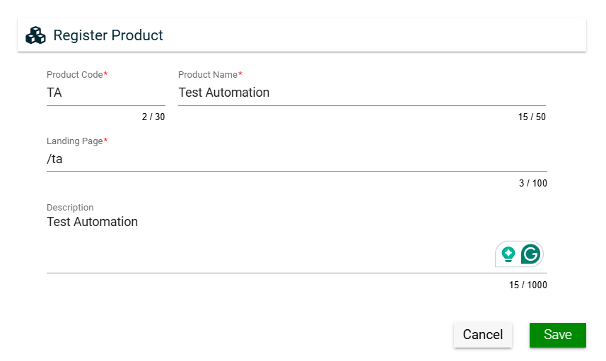
Create a product
To create a product, click Create New and enter valid values in the following fields:
Field
Description
Product Code
Code of the product.
Mandatory: Yes
Product Name
Name of the product.
Mandatory: Yes
Landing Page
URL of the first page the user will see when the application is loaded.
Mandatory: Yes
Description
Additional details of the product.
Mandatory: No
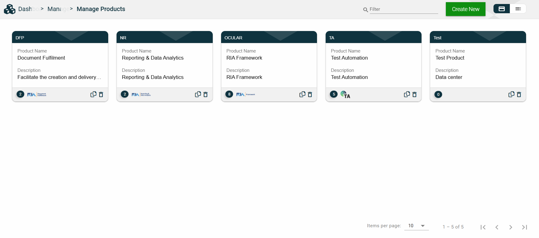
Views
Card View
The card view presents all applications in the form of cards, with the product code on the card header. The card displays the Product Name and Description. The card footer displays the number of applications associated with the product, the product logo, a duplicate icon, and a delete icon.
Clicking anywhere on the card, except the duplicate and trash icons, will redirect you to view the Product Details.
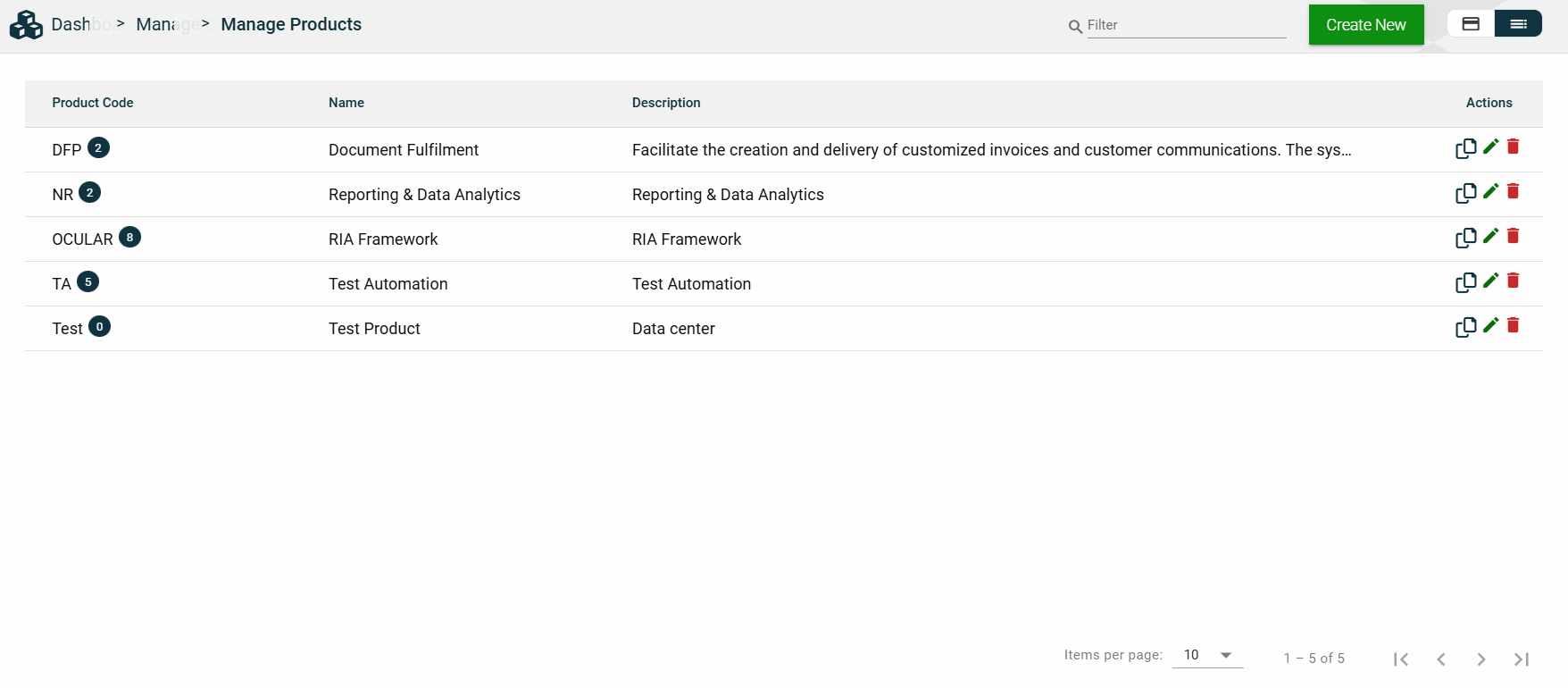
List View
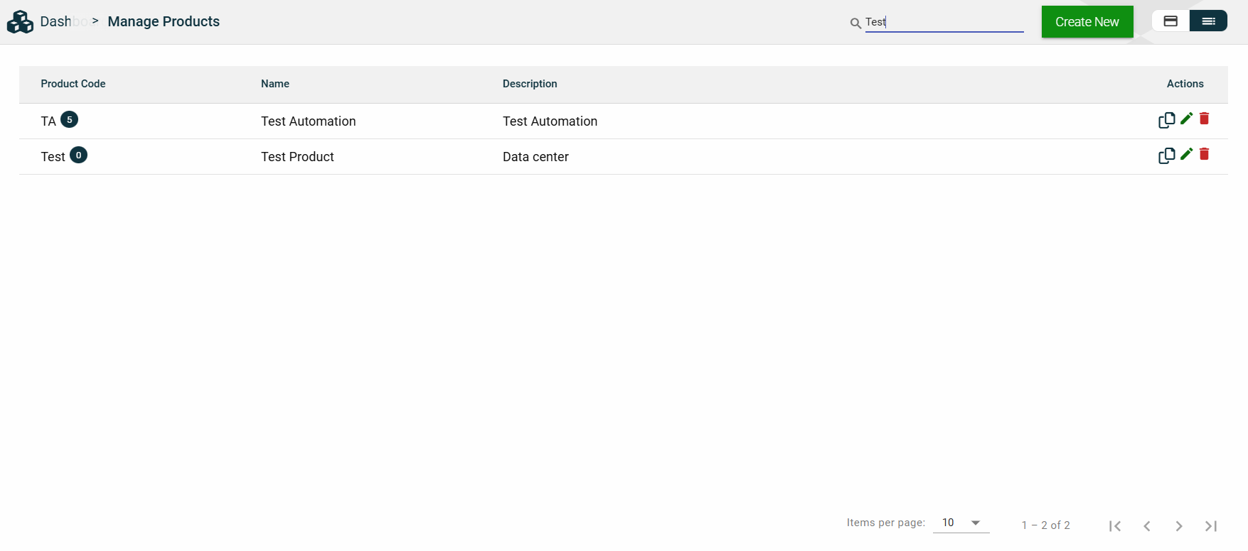
The list view displays all products in a table format, listing all the configured products in the framework.
Column Name
Description
Product Code
Code of the product. It also displays the number of applications associated with the product.
Name
Name of the product.
Description
Additional details of the product.
Actions
Displays the following icons:
— Clone icon that allows you to clone the selected dataset. When clicked, a popup window is displayed asking you to provide a new Product Code, Product Name, and Landing Page.
— Edit icon that allows you to edit the product details.
— Delete icon that allows you to delete the selected product.
Filter
You can filter or search for products by entering a partial or full product code or organization name. For example:
Sort
The following columns on the list view can be sorted:
Product Code
Name
Description
Product Details
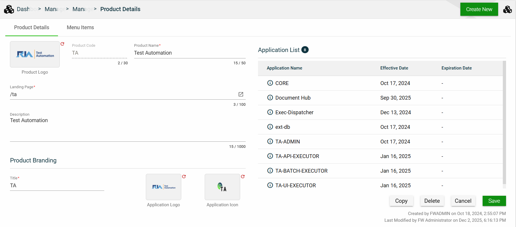
Product Details
The Product Details tab shows all the information you added when creating a product. For more information about the fields, see Create a product.
This tab also lists all applications making up the selected product. To view the application details, click on the Application Name hyperlink.
This tab allows you to update all the fields except for the Product Code. Additionally, you can choose to copy or delete the selected product.
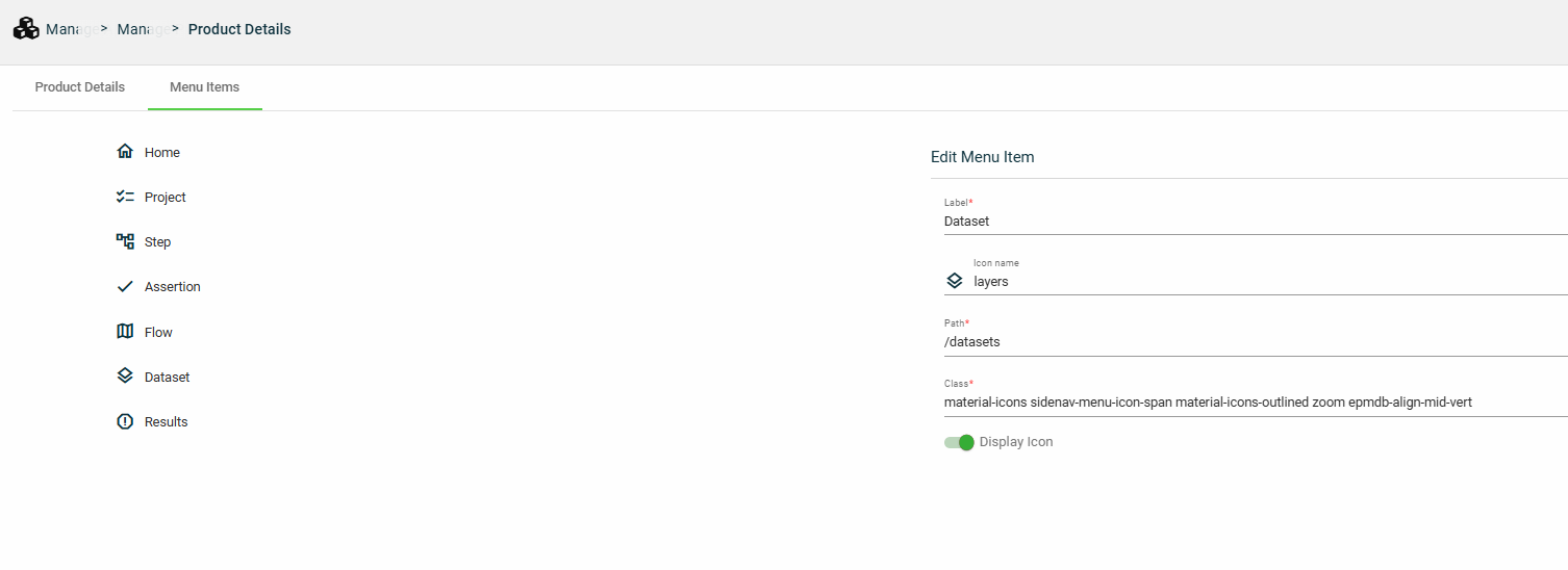
Menu Items
The Menu Items tab displays the left navigation menu items of your product. While you cannot add or delete a menu item, you can configure the following options for a menu item:
Field
Description
Label
Display name of the menu item.
Icon name
Name of the icon displayed beside the Label.
Path
Location path that is loaded when the menu item is clicked.
Class
Class idenitifying the group and style of elements.
Display icon
Enables you to display or hide the icon beside the Label.
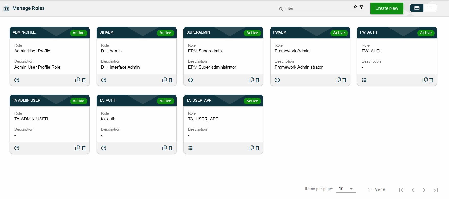
1.4 - Roles
Overview
The Roles module allows you to configure privileges or permissions at the following levels:
Application privileges
User privileges
Low-level security and access control
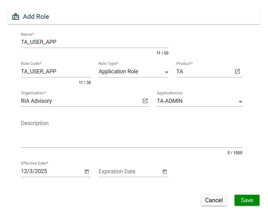
Create a role
To create a role, click Create New and enter valid values in the following fields:
Field
Description
Name
Name of the role.
Mandatory: Yes
Role Code
Code of the role.
Mandatory: Yes
Role Type
Type of the role. The following are the possible values:
Application Role — used to control application privileges when two applications communicate.
User Role — used to control user privileges.
Data Access Role — used for low-level security and access control.
Mandatory: Yes
Product
Product for which the role will be applicable.
To view the details of the selected product, click the go-to icon.
For more information about products, see Products.
Mandatory: Yes
Organization
Organization for which the role will be applicable.
To view the details of the selected products, click the go-to icon.
For more information about the organization, see Organizations.
Mandatory: No
Application(s)
Specific applications for which the role will be applicable.
Only the applications associated with the selected product will be displayed in the dropdown list.
Multiple applications can be selected for a role.
For more information about applications, see Applications.
Mandatory: No
Description
Additional details of the role.
Mandatory: No
Effective Date
Date when the role will be active.
Mandatory: Yes
Expiration Date
Date when the role will no longer be active.
Mandatory: No
Views
Card View
The card view presents all applications in the form of cards, with the role code on the card header. The card displays the Role and Description. The card footer displays an icon indicating the role type, a duplicate icon, and a delete icon.
Clicking anywhere on the card, except the duplicate and trash icons, will redirect you to view the role details.
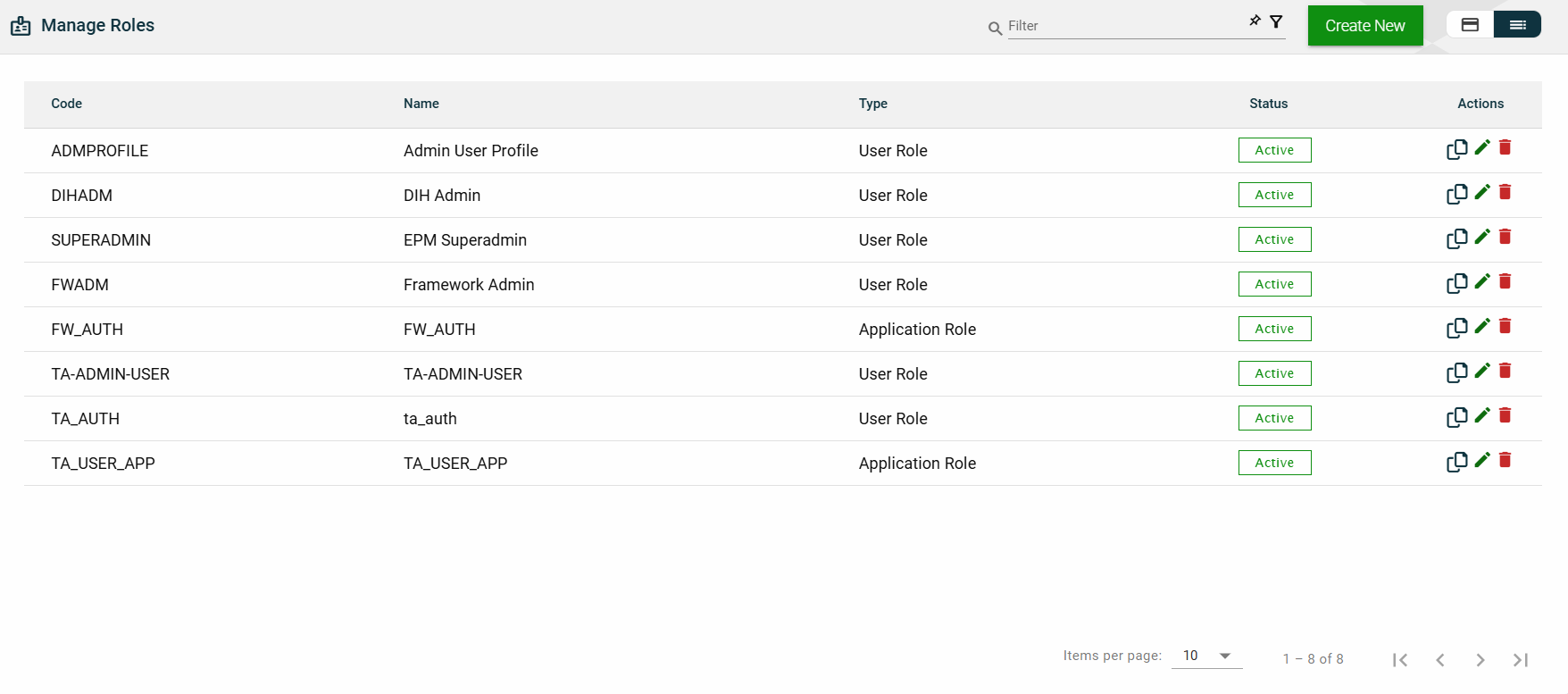
List View
The list view displays all roles in a table format.
Column Name
Description
Code
Code of the role.
Name
Name of the role.
Type
Type of the role.
Status
Status of the role.
Actions
Displays the following icons:
— Clone icon that allows you to clone the selected dataset. When clicked, a popup window is displayed asking you to provide a new Name and Role Code. All other configurations of the selected dataset are copied.
— Edit icon that allows you to edit the role details.
— Delete icon that allows you to delete the selected role.
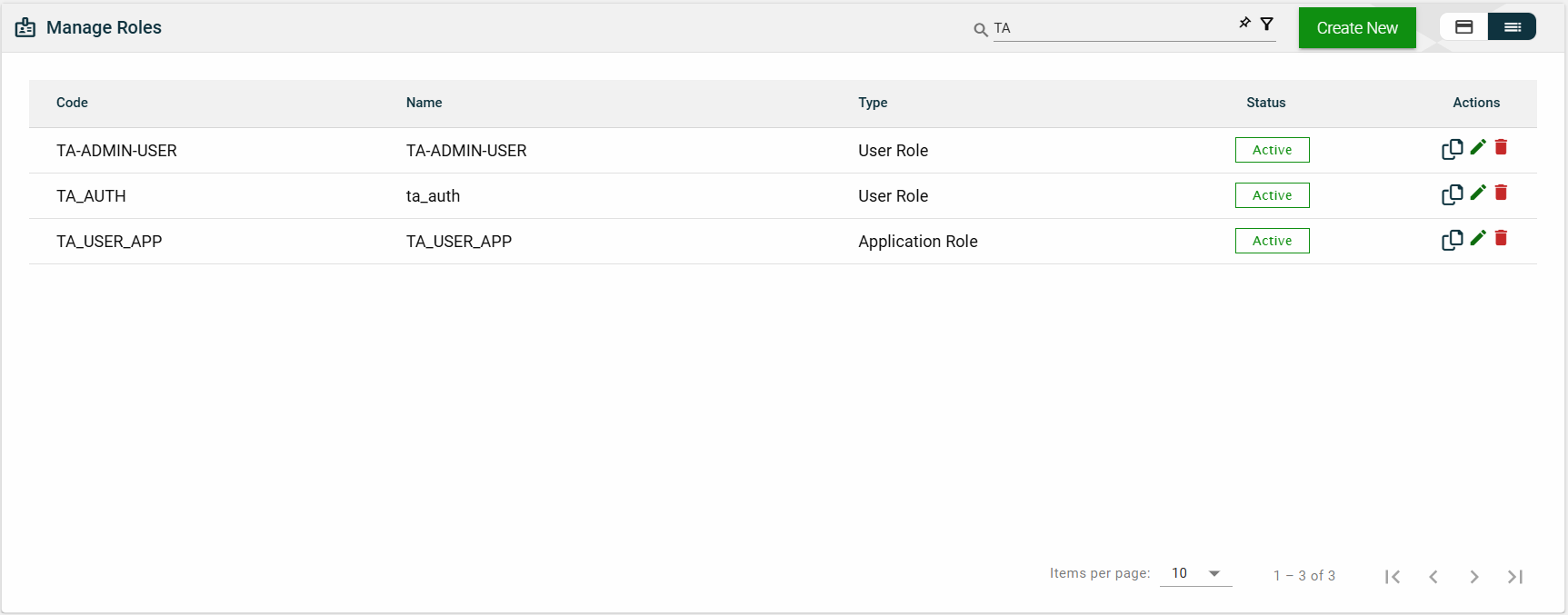
Filter
The following filters are available on both card and list views:
Effective Date
Product
Role Code
Role Name
Role Type
For example, entering a partial role name can filter the list.
Sort
The following columns on the list view can be sorted:
Code
Name
Type
Status
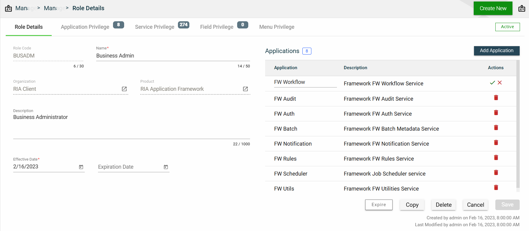
Role Details
Role Details
The Role Details tab shows all the information you added when creating a role. For more information about the fields, see Create a role.
This tab allows you to update all the fields except for the Role Code, Role Type, Product, and Organization. Additionally, you can choose to expire, copy, or delete the selected role from this tab.
This tab also lists all applications that can be accessed with the selected role. You can add an application by clicking Add Application.
You can also delete an application from the list by clicking .
To view the application privileges, see Application Privilege. To view the application details, click on the Application Name hyperlink.
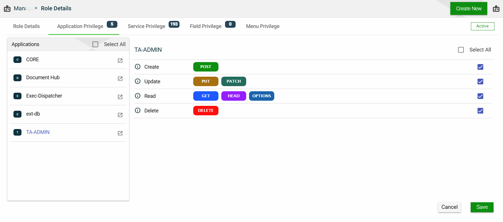
Application Privilege
This section controls the operation access for each application associated with the selected role. The same applications listed in the Role Details will be the same applications listed in this section.
To assign an operation access to an application, follow these steps:
Select an application.
Tick all the operation access you want to apply to the selected application.
Click Save.
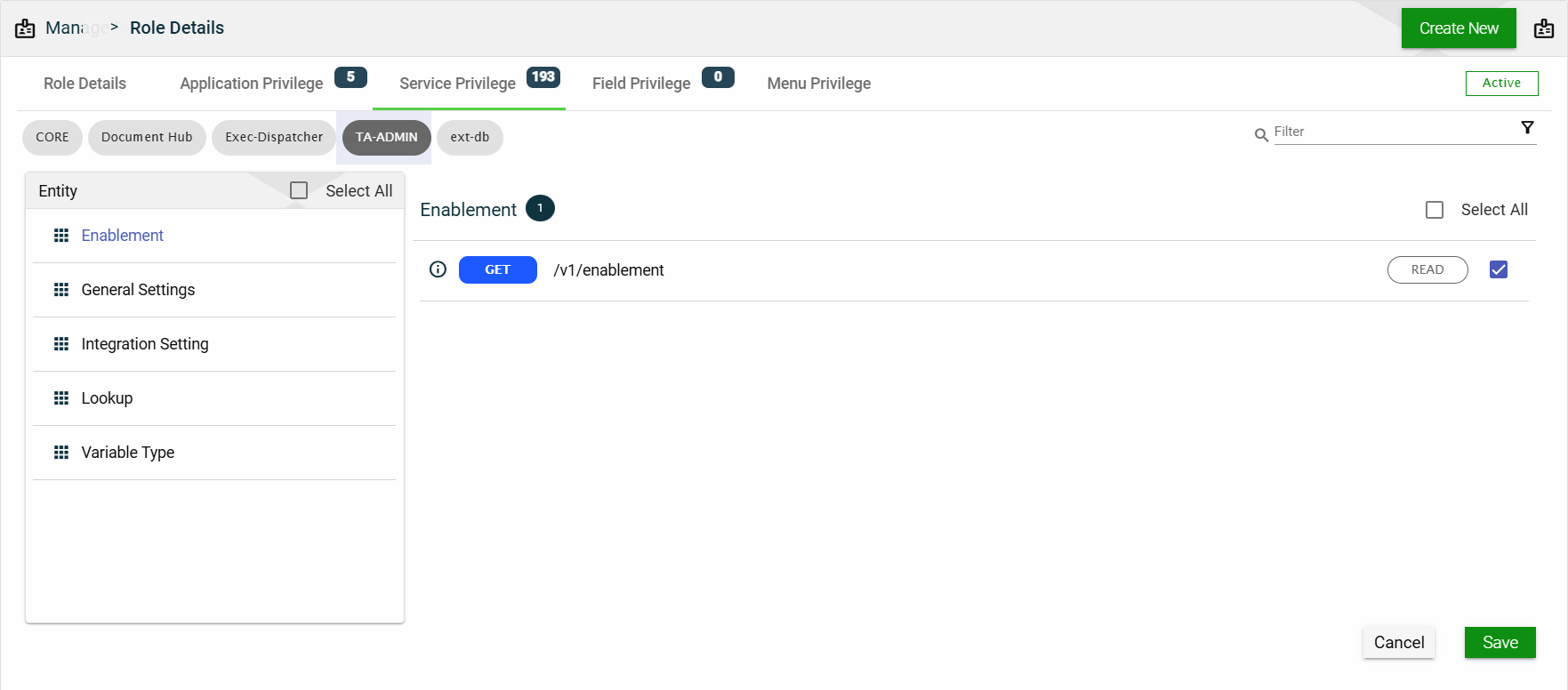
Service Privilege
This section controls access to every single REST service associated with the applications listed in the Role Details.
Each application lists all the entities configured to it. When you select an entity, all the services and the access for each service are displayed.
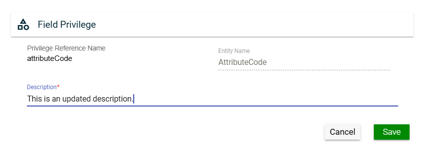
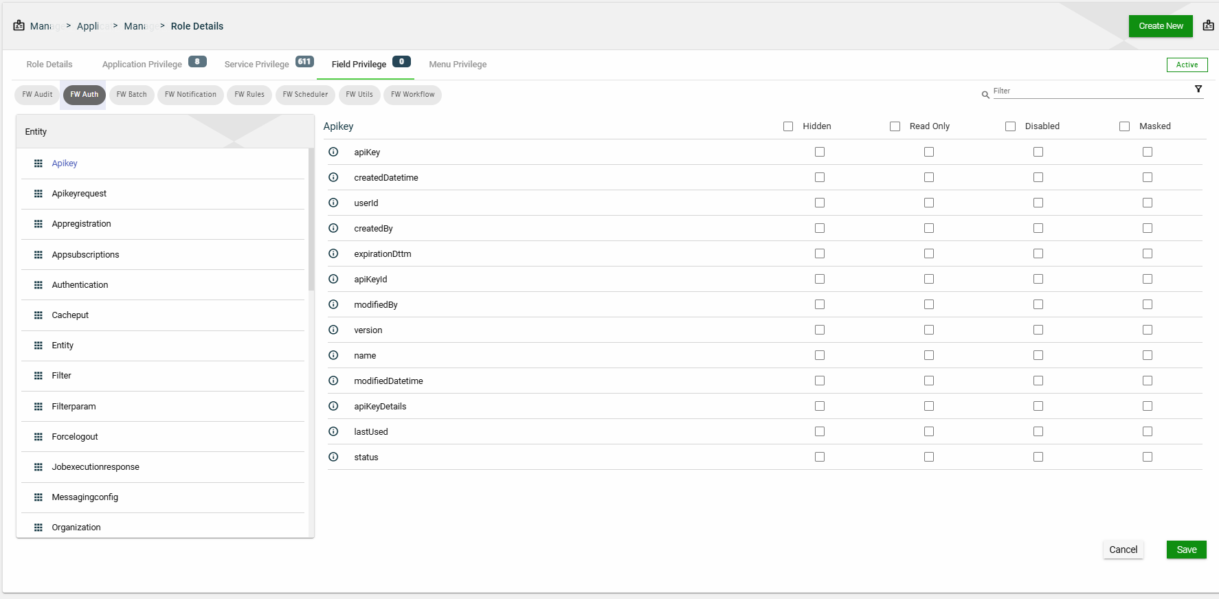
Field Privilege
This section controls the field-level access of entities associated with the applications listed in the Role Details.
Entities configured with fields are displayed for each application associated with the selected role. When you select an entity, all the fields configured to it are displayed. You have the option to select the following setting:
Disabled
Hidden
Read Only
Masked
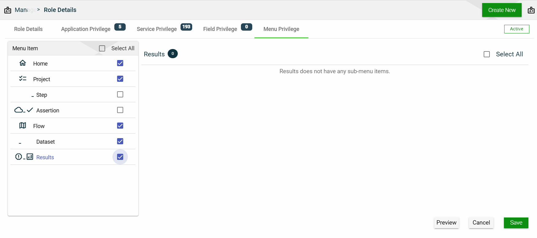
Menu Privilege
This section allows you to manage access to menu items. All available menu items are listed here, and selecting one will show all of its sub-menu items.
To display a menu item to a user with the selected role, tick the checkbox. If you don’t want to display that menu item to the user, untick the checkbox.
The Role Groups module allows you to create groups of multiple Roles that can be easily assigned to Organizations. This simplifies the role assignment process, allowing organizations to manage the roles effectively and ensure that the correct privileges are assigned to the appropriate individuals.
Create a role group
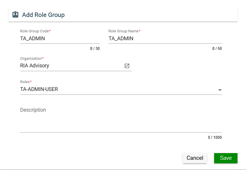
To create a role group, click Create New and enter valid values in the following fields:
Field
Description
Role Group Code
Code of the role group.
Mandatory: Yes
Role Group Name
Name of the role group.
Mandatory: Yes
Organization
Organization for which the role group will be applicable.
To view the details of the selected products, click the go to icon. (similar behavior with product).
For more information about organization, see Organizations.
Mandatory: No
Roles
Roles to be included in the role group.
Only the roles associated with the selected organization will be displayed in the dropdown list.
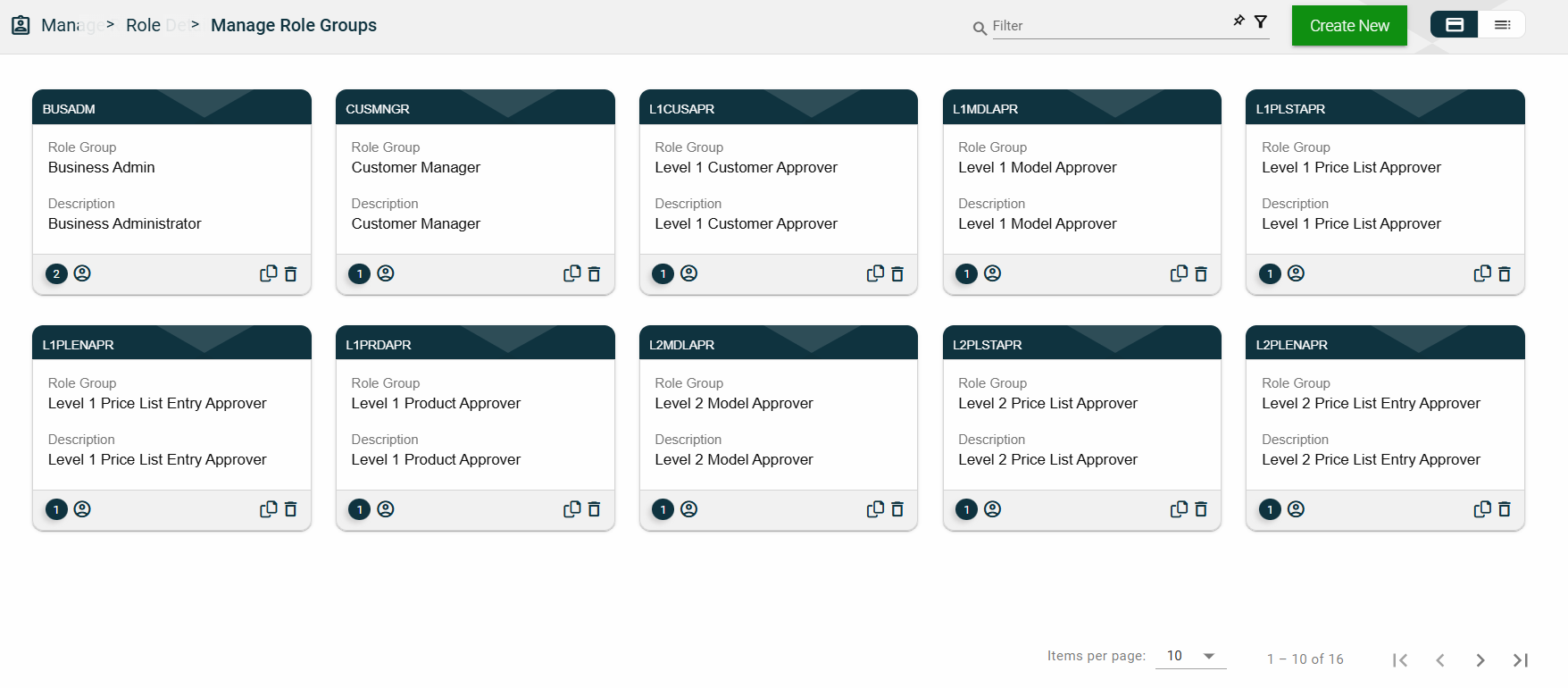
The card view presents all role groups in the form of cards, with the role group code on the card header. The card displays the Role Group name and Description. The card footer displays the number of roles in the role group, a duplicate icon, and a delete icon.
Clicking anywhere on the card, except the duplicate and trash icons, will redirect you to view the role group details.
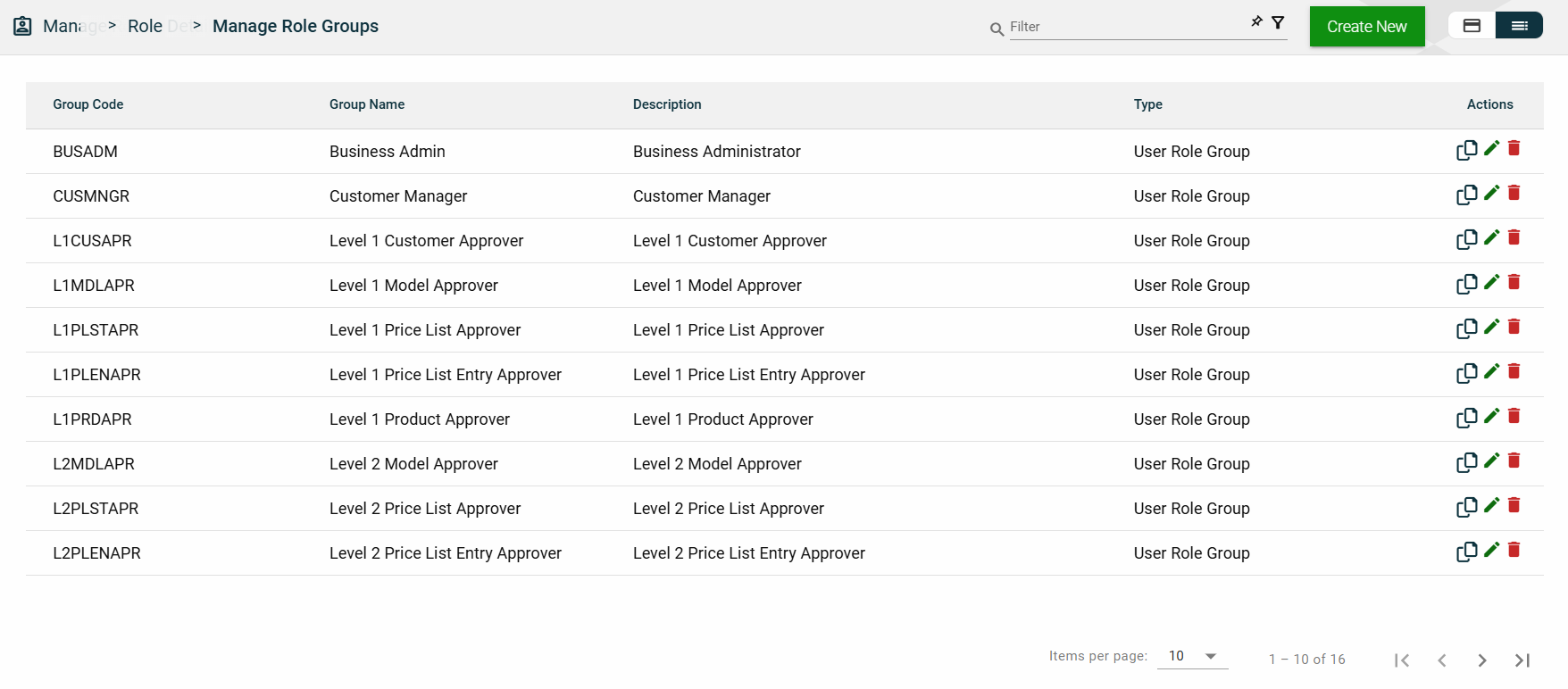
List View
The list view displays all role groups in a table format, listing all available role groups in the framework.
Column Name
Description
Group Code
Code of the role group.
Group Name
Name of the role group.
Description
Additional details of the role group.
Actions
Displays the following icons:
— Clone icon that allows you to clone the selected dataset. When clicked, a popup window is displayed asking you to provide a new Role Group Code and Role Group Name. All other configurations of the selected dataset are copied.
— Edit icon that allows you to edit the role group details.
— Delete icon that allows you to delete the selected role group.
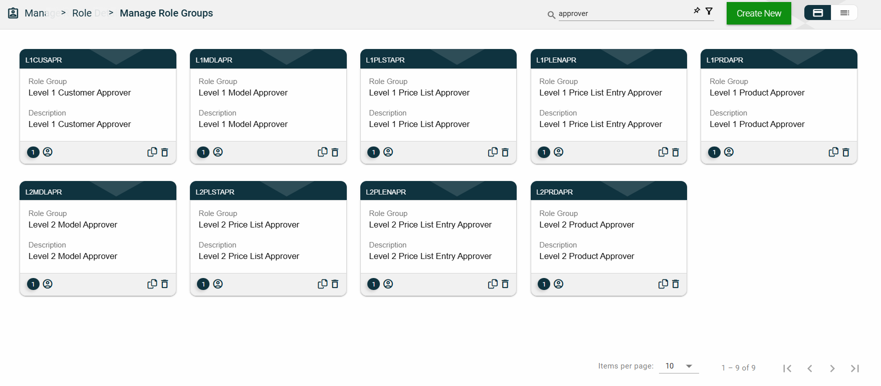
Filter
The following filters are available on both card and list views:
Role Group Code
Role Group Name
Sort
The following columns on the list view can be sorted:
Group Code
Group Name
Description
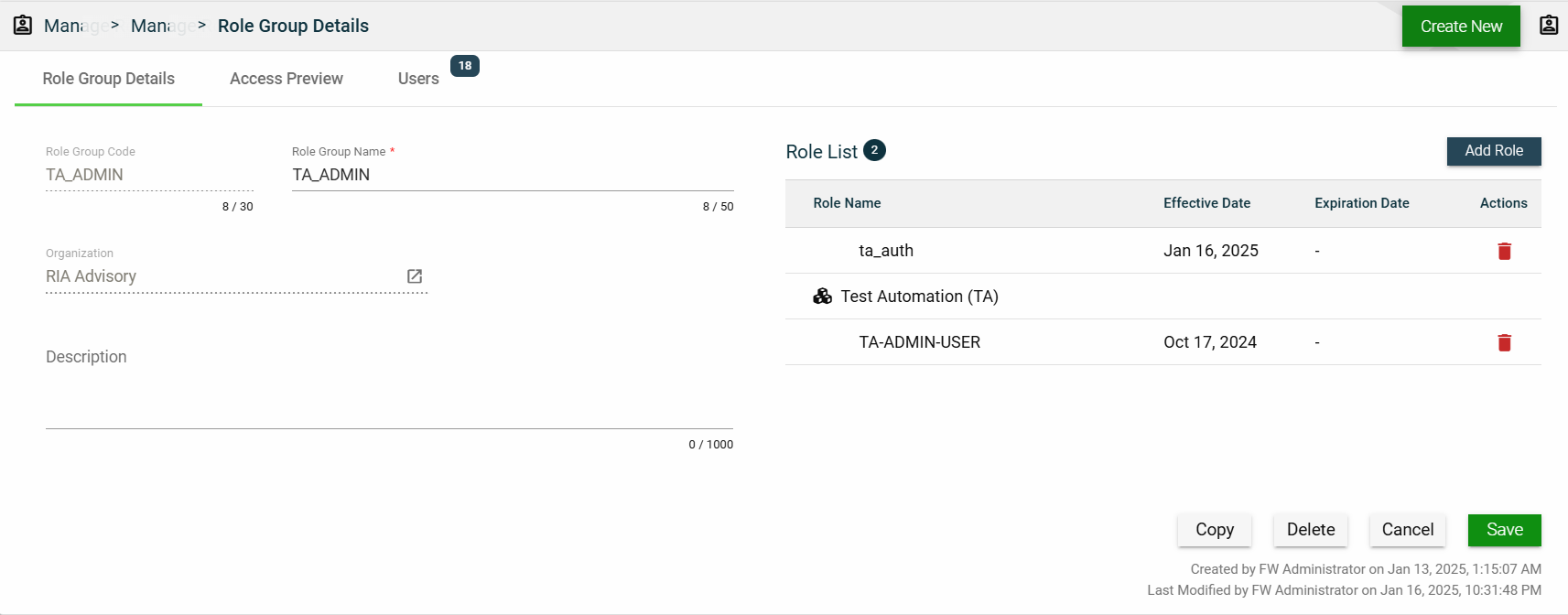
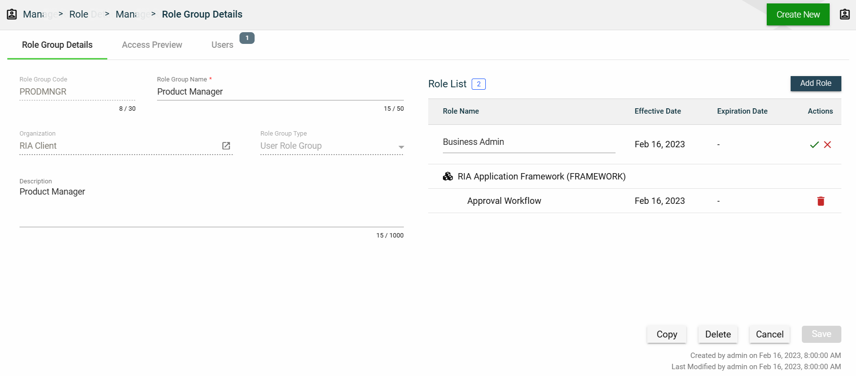
Role Group Details
Role Group Details
The Role Group Details tab shows all the information you added when creating a role group. For more information about the fields, see Create a role group.\
This tab allows you to update all the fields except for the Role Group Code and Organization. Additionally, you can choose to copy or delete the selected role group from this tab.
The roles added to the role group are displayed in the Role List table. You can also add a new role by clicking Add Role.
You can also delete a role group from the list by clicking .
To view the role details, click on the Role Name hyperlink. This will direct you to the Role Details
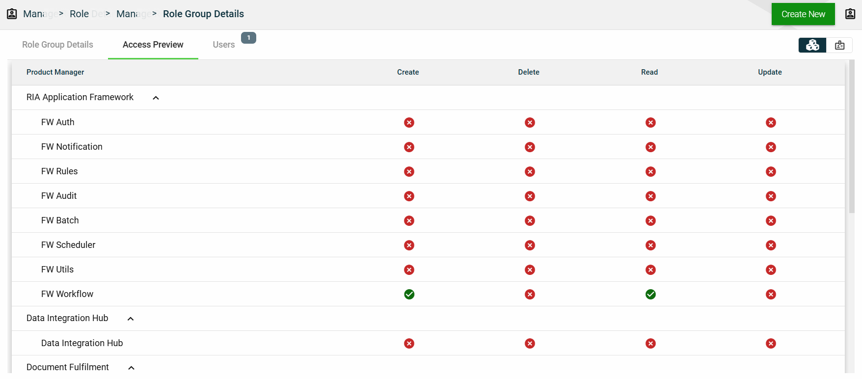
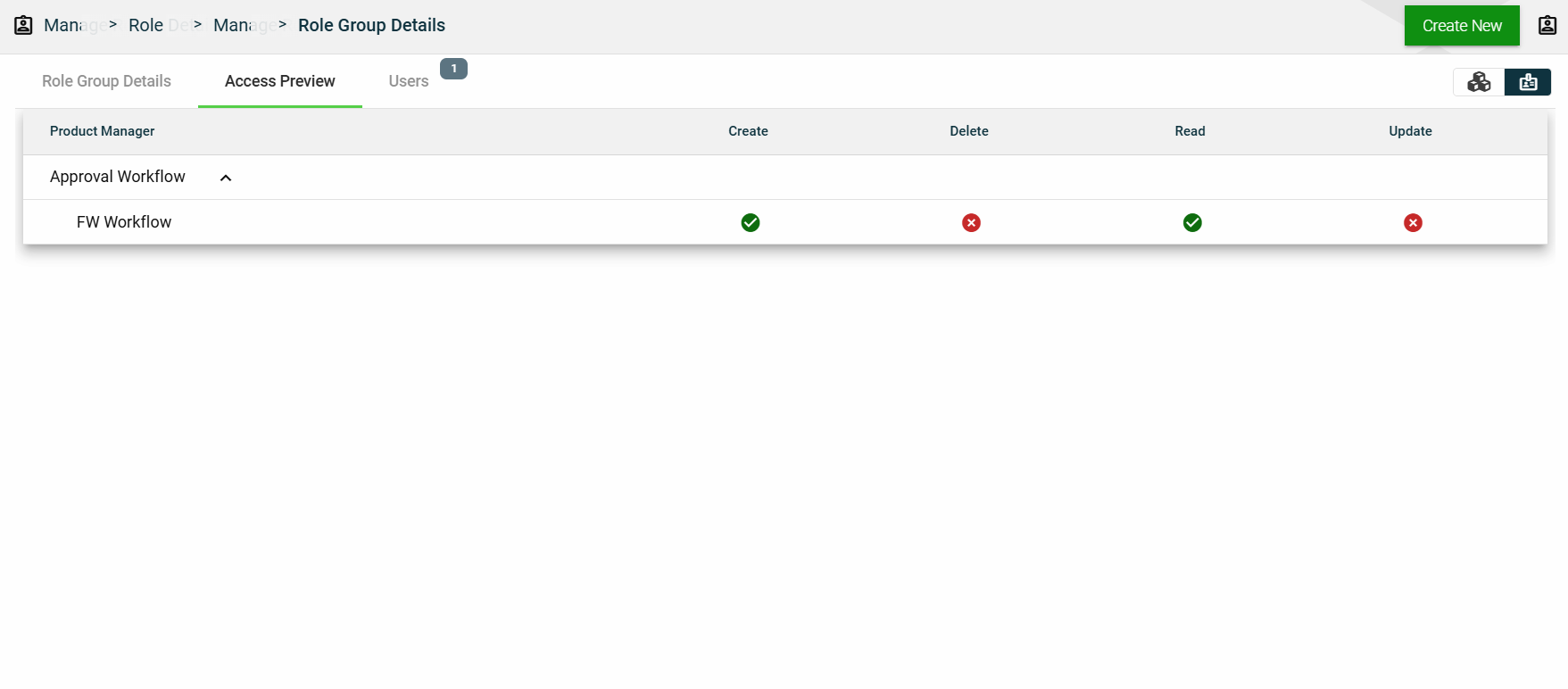
Access Preview
This section summarizes all the privileges given to the applications accessed by the role group. You can view the access preview in the following ways:
By Products
By Roles
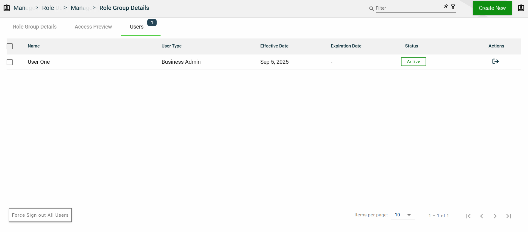
Users
This section lists all users assigned in the role group.
1.6 - Users
Overview
Users represent the users of the Products configured for your Organization. The following are the various types of users that identify the level of access across the product suite:
User Type
Organization
Access
Framework Admin
Products owners
Full access to framework modules and services
No access to products purchased by clients
Business Admin
Client organization
Limited access to framework modules and services
Limited access to purchased products based on assigned roles and privileges
Business User
Client organization
No access to framework modules and services
Limited access to purchased products based on assigned roles and privileges
Create a user
To create a user, click Create New and enter valid values in the following fields:
Field
Description
User Name
Username to be used when loggin in the product.
Mandatory: Yes
User Type
Type of the user. The following are the possible values:
Business User — end user of the product.
Admin User — administrator in the organization who controls the settings in the framework or product.
Framework Admin — super user who has access to all modules and functionalities of the framework and product.
When creating a new user using a business user, the user type is automatically populated with Business User.
Mandatory: No
First Name
First name of the user.
Mandatory: Yes
Last Name
Last name of the user.
Mandatory: No
Company Code
Code of the company where the user belongs to.
Mandatory: Yes
Authentication Type
Type of authentication to be used when logging in the product. The following are the possible values:
Basic Authentication
OAuth 2.0 Authentication
Mandatory: Yes
Password
Password you need to supply when you select Basic Authentication.
You can also opt to let the system generate a password for you by clicking the Autogenerate link.
To view the password, click eye icon.
Mandatory: Yes
Locale
Primary language used in the organization.
Mandatory: No
Organization
Organization where the user belongs to.
Mandatory: Yes
Comments
Additional details of the user.
Mandatory: No
Effective Date
Date when the user will be active.
Mandatory: Yes
Expiration Date
Date when the user will no longer be active.
Mandatory: No
Force user to change password on first login
If this setting is enabled, users are forced to change their password on their first login.
Default: Enabled
Send credentials via email
If this setting is enabled, configured User Name and Password will be sent to the user via email.
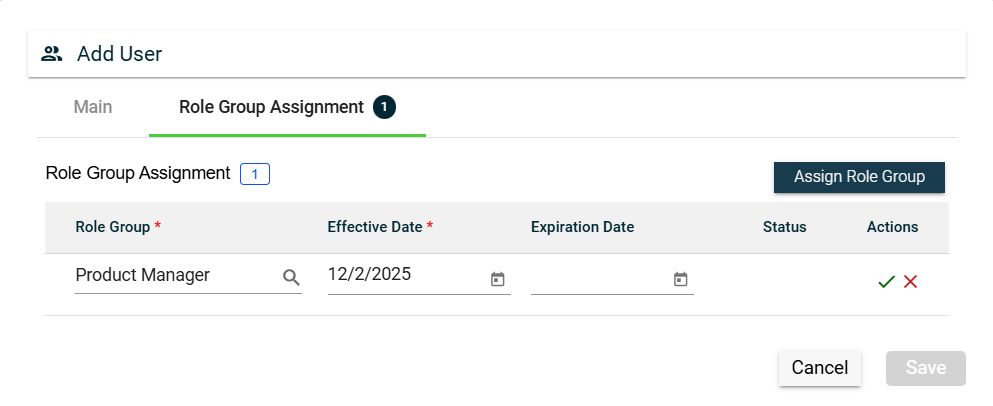
To assign a role group to your user, follow these steps:
Navigate to the Role Group Assignment tab.
Click the Assign Role Group button.
Search for an available Role Group. To configure a role group, see Role Group.
Set the Effective Date.
Set the Expiration Date.
To save, click the check mark.
To cancel the role group assignment, click X.
To assign another role group, follow the steps above.
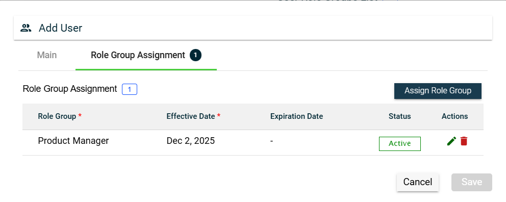
To edit a role group, click and make the necessary changes.
To delete a role group, click .
Views
Card View
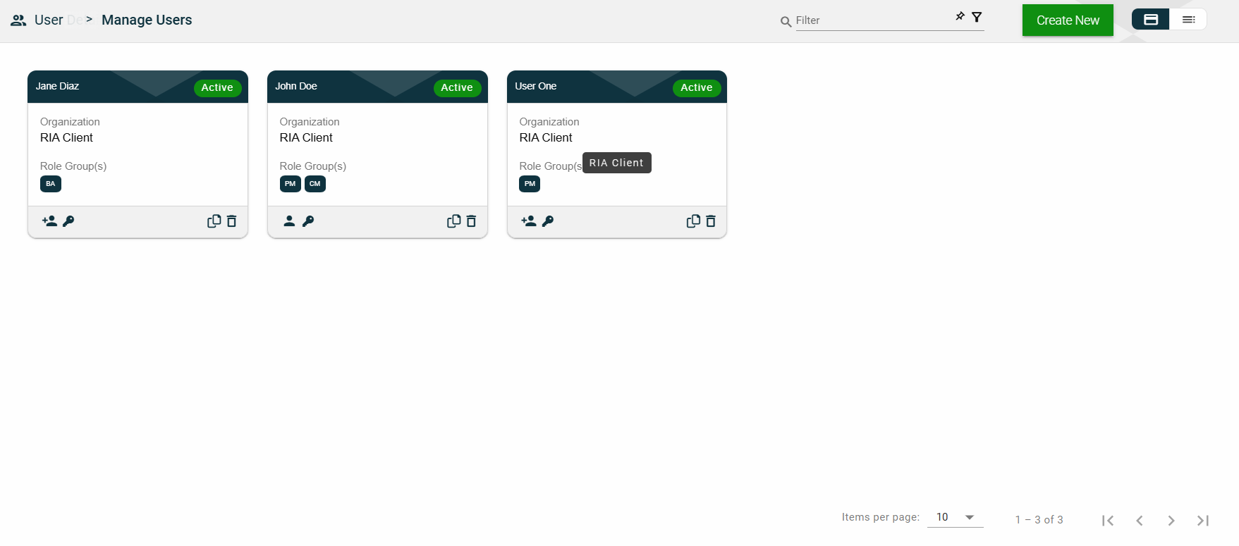
The card view presents all users in the form of cards, with the user’s first and last names and the status on the card header. The card displays the Organization name and Role Group(s). The card footer displays an icon indicating the user type, a duplicate icon, and a delete icon.
Clicking anywhere on the card, except the duplicate and trash icons, will redirect you to view the User Details.
List View
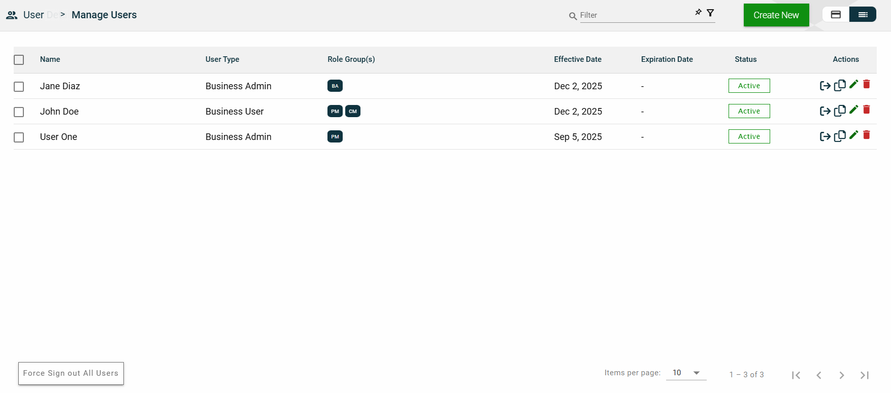
The list view displays all users in a table format.
Column Name
Description
Name
Code of the role group.
User Type
Type of the user.
Role Group(s)
Role groups where the user belongs to.
Effective Date
Date when the user becomes active.
Expiration Date
Date when the user becomes no longer active.
Status
Status of the user.
Actions
Displays the following icons:
— Clone icon that allows you to clone the selected user. When clicked, a popup window is displayed asking you to provide a new User Name, First Name, Company Code, and Password. All other configurations of the selected user are copied.
— Edit icon that allows you to edit the user details.
— Delete icon that allows you to delete the selected user.
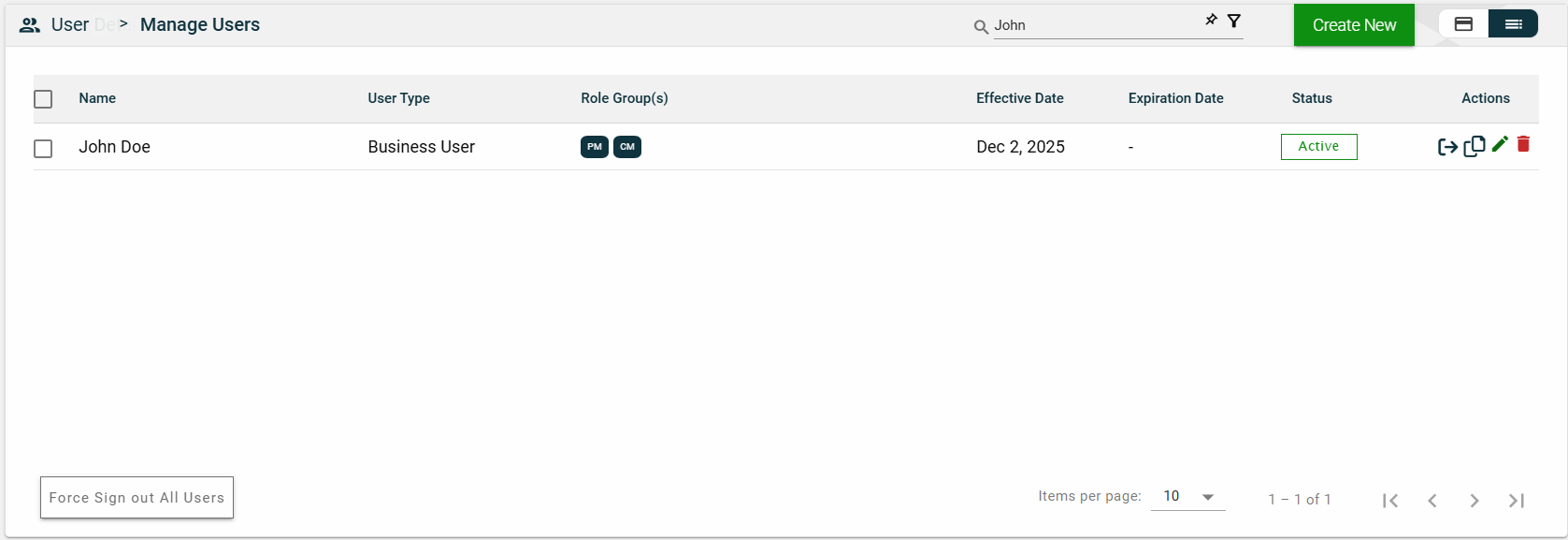
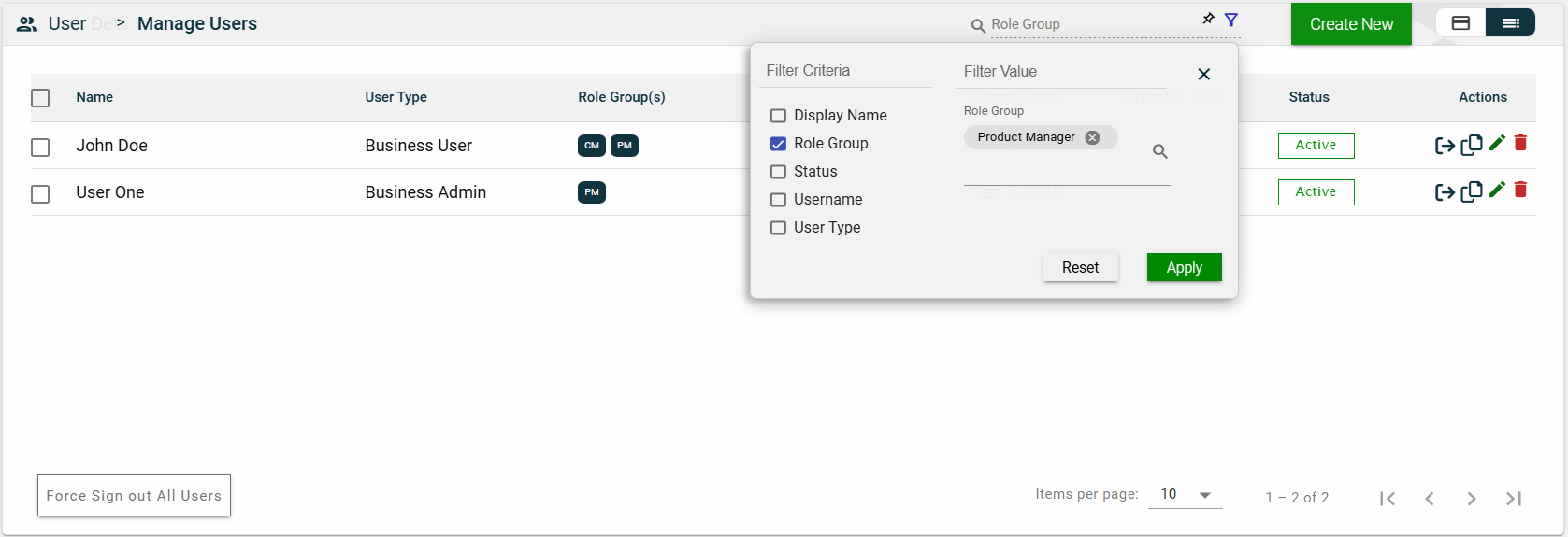
Filter
To filter the list, you can enter a partial or complete name. For example,
You can also specify a parameter and enter the filter value for it. The following filters are available on both card and list views:
Display Name
Role Group
Status
Username
User Type
For example, you can select the Role Group and select a value from the dropdown list.
Sort
The following columns on the list view can be sorted:
Name
User Type
Effective Date
Expiration Date
Status
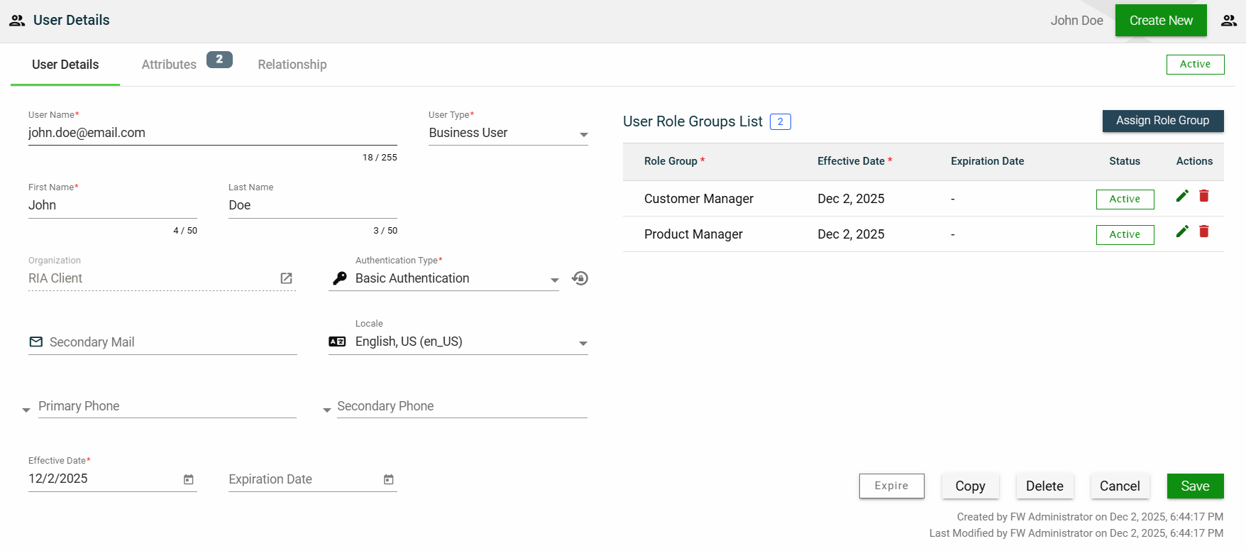
User Details
The User Details tab shows all the information you added when creating a role group. For more information about the fields, see Create a role group. Additionally, this tab allows you to add the following user information:
Secondary Mail — alternate email address for backup purposes.
Primary Phone — primary contact number of the user.
Secondary Phone — alternate contact number of the user.
This tab allows you to update all the fields except for the User Type and Organization. Additionally, you can choose to expire, copy, or delete the selected role group from this tab.
The role groups to which the user belongs are displayed in the User Role Groups List table. You can also add a new role by clicking Assign Role Group.
You can edit the effective and expiration dates of a role group. You can also delete a role group from the list by clicking .
To view the role group details, click on the Role Group hyperlink.
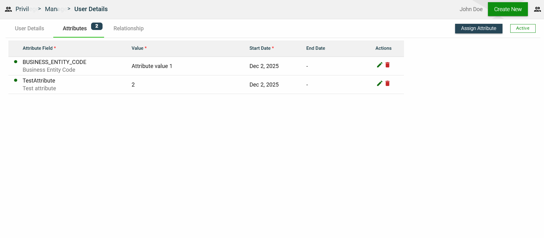
Attributes
The attributes tab displays the properties associated with the user, including their value, effective date, and expiration date. It also allows users to add, edit, or delete an attribute.
1.7 - Privilege Codes
Overview
Privilege Codes provide detailed control over access to application resources, services, and individual fields.
These codes serve as a centralized permission layer and can be applied at various levels:
Application-Level — Control access to REST endpoints and operations such as create, read, update, and delete.
Service-Level — Control access to internal framework services and capabilities.
Field-Level — Control visibility and behavior of fields in API requests/responses or UI forms.
Privilege Codes are both configurable and extensible. The framework comes with a set of commonly used privilege codes out of the box, and developers can create additional custom privilege codes based on the specific needs of their applications.
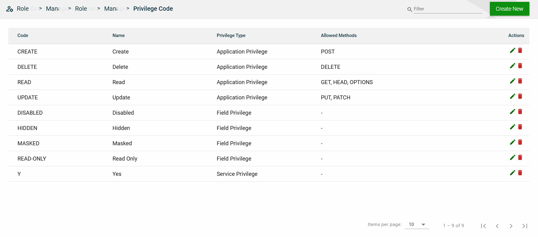
Application-level privileges
Code
Name
Description
Allowed Methods
CREATE
Create
Grants permission to create resources.
POST
DELETE
Delete
Grants permission to delete existing resources.
DELETE
READ
Read
Grants read-only access to retrieve resources.
GET, HEAD, OPTIONS
UPDATE
Update
Grants permission to modify existing resources.
PUT, PATCH
Service-level privileges
Code
Name
Description
Y
Yes
Indicates that access to the service is permitted. Used for service-level privilege checks.
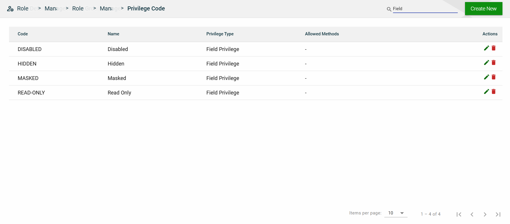
Field-level privileges
Code
Name
Description
DISABLED
Disabled
Field is visible but not editable.
HIDDEN
Hidden
Field is not visible to the user.
MASKED
Masked
Field is visible but displayed in masked form (e.g., ****).
READ-ONLY
Read Only
Field value can be viewed but not modified.
Create a privilege code
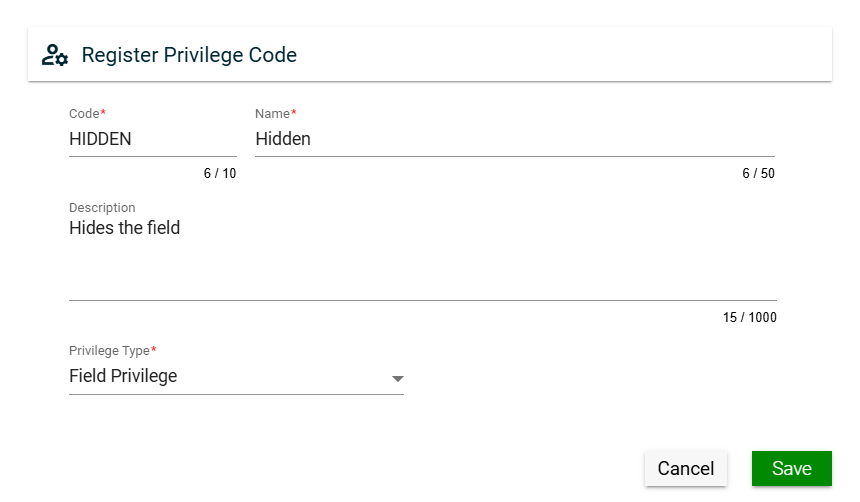
To create a privilege code, click Create New and enter valid values in the following fields:
Field
Description
Code
Code of the privilege.
Mandatory: Yes
Name
Name of the privilege.
Mandatory: Yes
Description
Additional details of the privilege.
Mandatory: Yes
Privilege Type
Specifies the level for which you want to define a privilege. The following are the possible values:
Application Privilege — when selected, you also have to specify allowed HTTP methods.
Service Privilege
Field Privilege
Menu Item Privilege
Mandatory: Yes
View
Field
Description
Code
Code of the privilege.
Name
Name of the privilege.
Privilege Type
Specifies the level for which you want to define a privilege. The following are the possible values:
Application Privilege
Service Privilege
Field Privilege
Menu Item Privilege
Allowed Methods
Specifies the allowed HTTP methods for an application privilege.
This column is empty for other privielege types.
Actions
Displays the following icons:
— Edit icon that allows you to edit the privilege code details.
— Delete icon that allows you to delete the selected privilege code.
Filter
You can filter the list by entering a partial or full name in the search field.
Sort
The following columns on the list view can be sorted:
Code
Name
Privilege Type
Allowed Methods
2 - Utilities
2.1 - Lookup
Overview
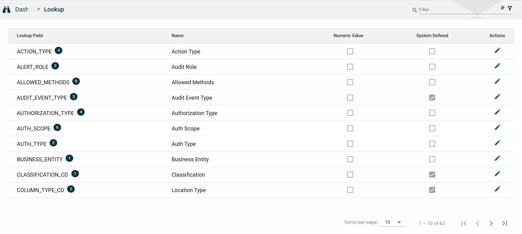
The Lookup module lists all the lookup fields used by API services of the RIA Framework. A lookup field is a dropdown list that allows you to select a value from a predefined set of options. The options for a lookup field are in the Lookup Values table.
All the items listed in this module are part of the RIA Framework package. You cannot create or delete a lookup field. You can only modify display names or lookup values. For more information, see Edit lookup.
Note: If you have framework admin access, you can see all lookup fields in the RIA Framework.
If you have business admin access, you can only see the lookup fields from the modules you have access to.
Views
List View
Field
Description
Lookup Field
Unique identifier of a lookup.
The lookup field should match a column name in an Ocular table.
Lookup values defined under the lookup will be used as data for that column.
Name
Label name of the field as displayed in the application.
Numeric Value
Indicates if a numeric value is required for the lookup field.
System Defined
Indicates if the lookup field is system-defined.
If a field is system-defined, you cannot add or delete a new lookup value.
However, you can do the following:
Edit the display names of a lookup field and its values.
See Edit lookup.
Hide a lookup value by ticking the icon.
Actions
Displays
that allows you the following:
View the details and the lookup values of a lookup field.
See Lookup values.
Edit the display name of a lookup and the configured lookup values.
See Edit lookup.
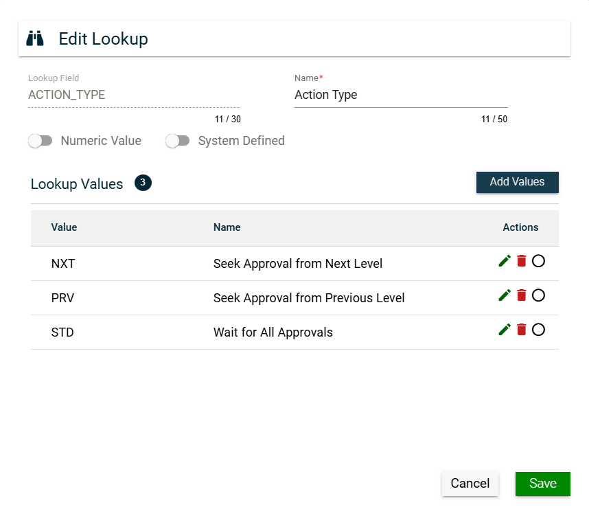
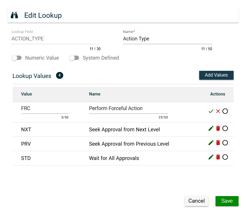
Lookup Values
The Lookup module allows you to view the details and the lookup values of a lookup field by clicking in the Actions column.
A lookup value is a pre-defined option for a lookup field. The Edit Lookup window displays a Lookup Values table listing all the configured lookup values for the selected lookup field.
Field
Description
Add Values
Allows you to add lookup values for lookup fields that are not system-defined.
This button is disabled for lookup fields that are system-defined.
Value
Value in the lookup field as stored in the database.
Name
Name of the values as displayed in the UI.
Actions
Displays the following icons:
— Edit icon that allows you to edit the display name of a lookup value.
— Delete icon that allows you to delete a lookup value. This is only enabled
for lookup fields that are not system-defined. Otherwise, a disabled trash
icon is displayed.
— Button that allows you to hide a lookup value from the options. When ticked,
it will look like
.
Edit lookup
The Lookup module allows you to edit a lookup field by clicking in the Actions column.
For lookup fields that are not system-defined, you can do the following:
Edit the display name of a lookup field by updating the Name field.
Edit the display name of a lookup value by clicking in the Actions column of the Lookup Values table and updating the Name column value.
Add a lookup value by clicking Add Values and entering valid values in the Value and Name columns.
Hide a lookup value by ticking .
Remove a lookup value from the list by clicking .
For lookup fields that are system-defined, you can do the following:
Edit the display name of a lookup field by updating the Name field.
Edit the display name of a lookup value by clicking in the Actions column of the Lookup Values table and updating the Name column value.
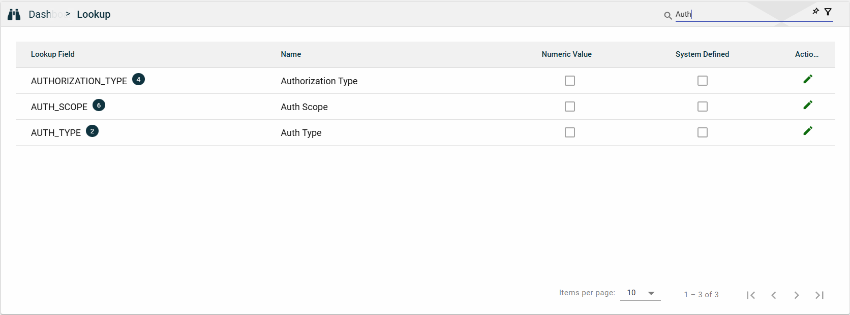
Search
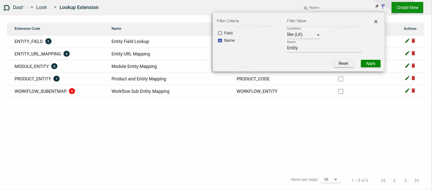
To search for an item on the Lookup page, enter a keyword for a Lookup Field or Name.
You can input a valid lookup field to search for an itemv or you can input a partial lookup name to search for an item.
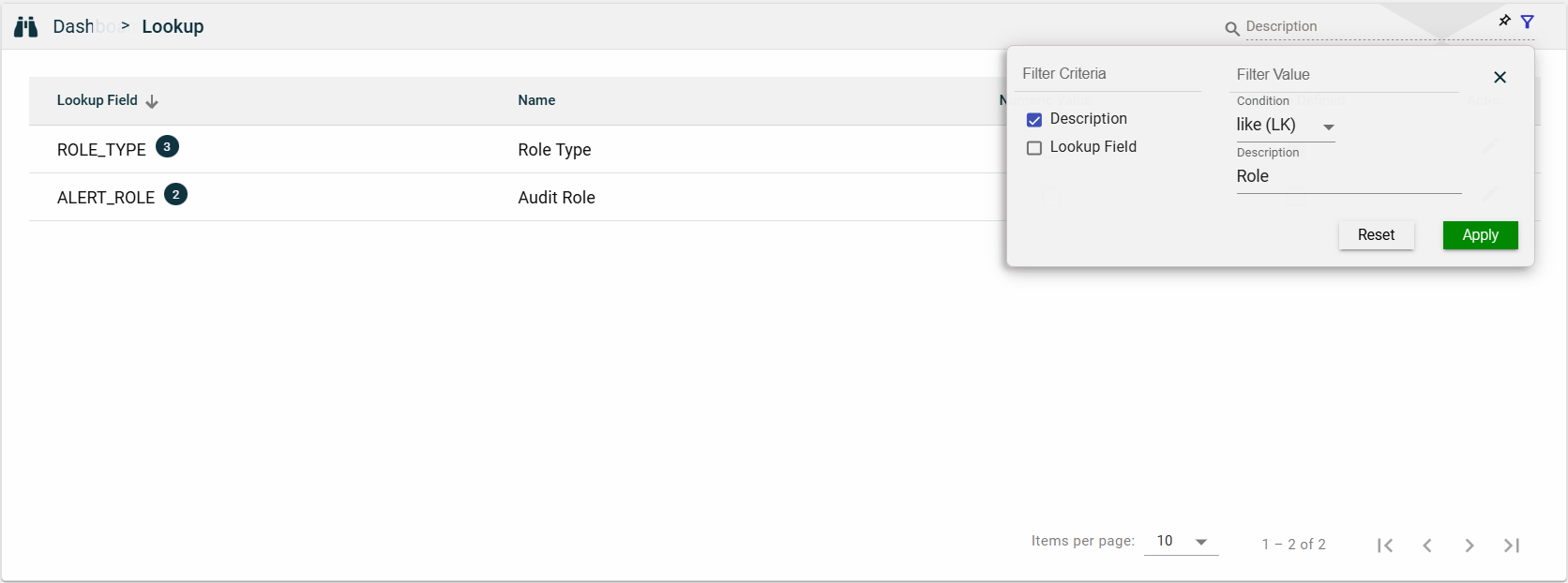
Filter
The following filters are available:
Description
Lookup Field
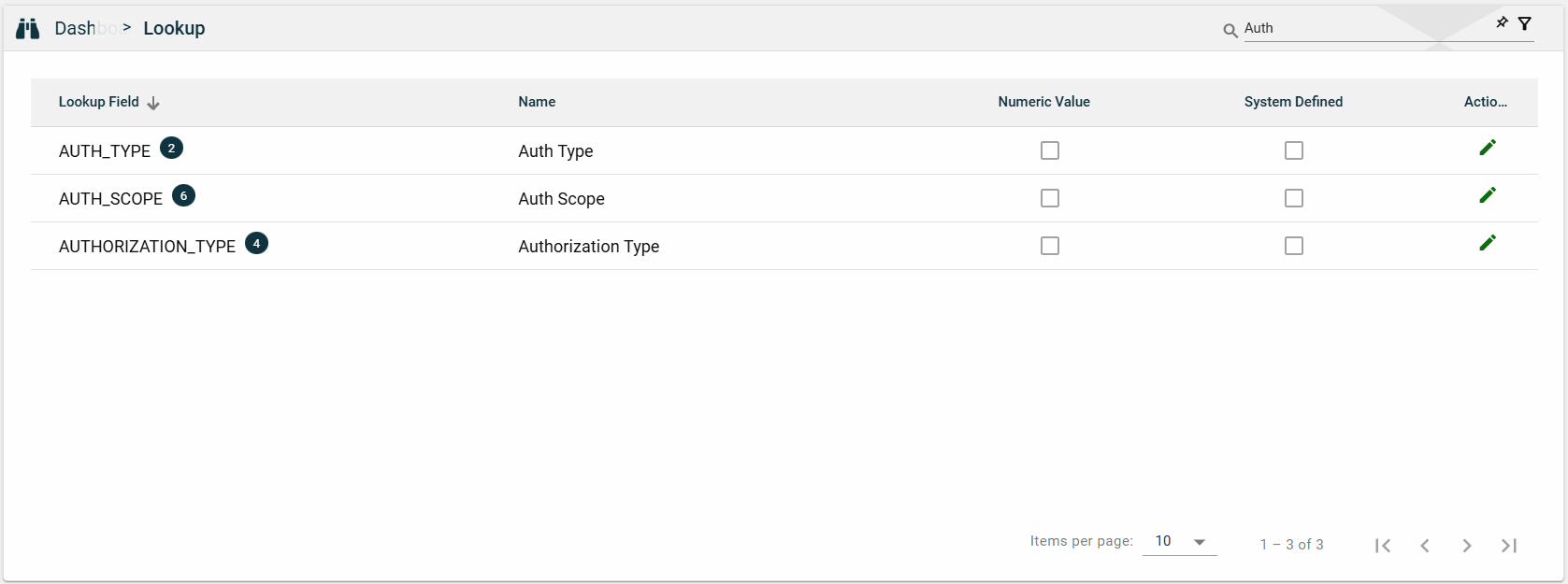
Sort
The following columns on the list view can be sorted:
Lookup Field
Name
Numeric Value
System Defined
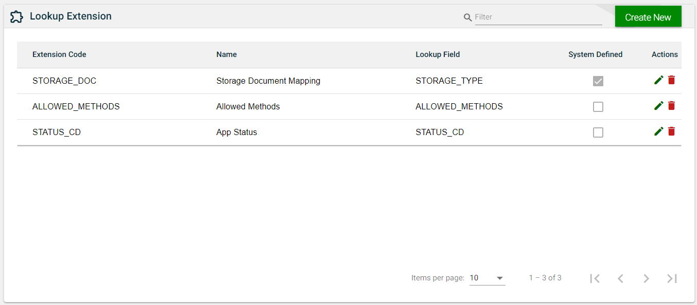
2.2 - Lookup Extension
Overview
The Lookup Extension module lists all the lookup fields with configurable UI properties. The configured UI properties are not stored in any database and are not used in any API processing.
This module allows you to create, edit, or delete a lookup extension.
Create a lookup extension
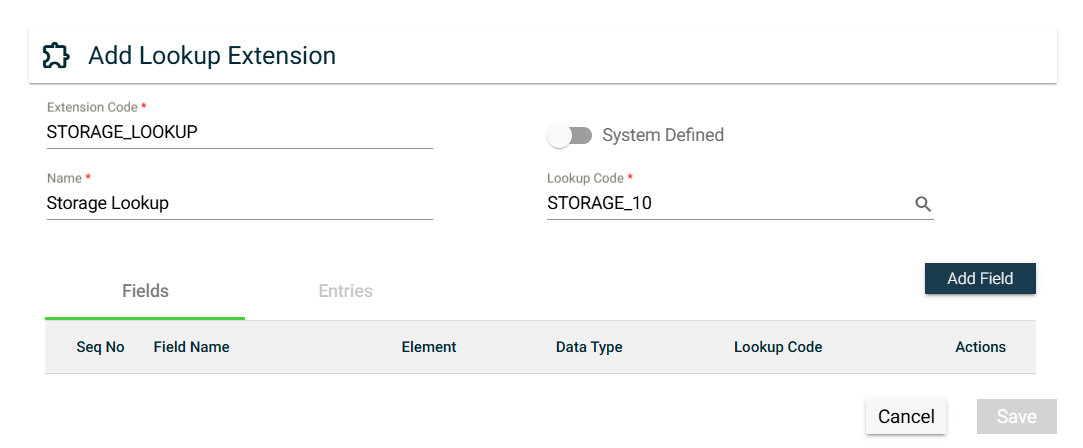
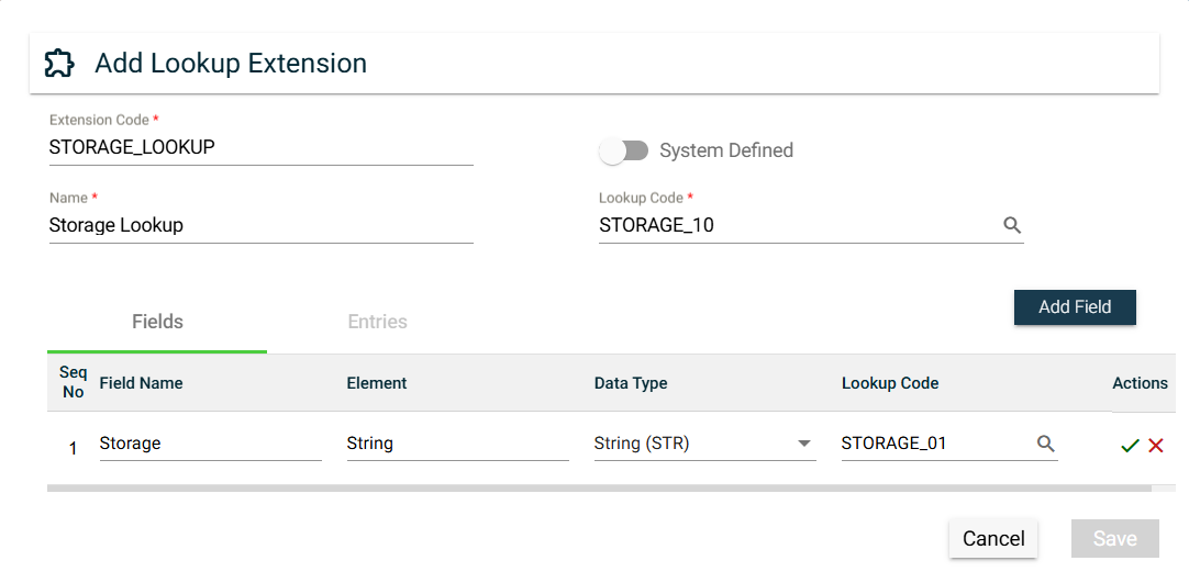
To create a lookup extension, click Create New and enter valid values in the following fields:
Field
Description
Extension Code
Name of the lookup extension used in the backend.
System Defined
Sets the lookup extension to be system defined.
A lookup extension that is system defined cannot be updated or deleted by the users.
User Mapping
Only visible when System Defined is enabled.
Allows the user to provide site-specific mappings between the lookup extension
being created and the selected value in the Lookup Code.
Name
Name of the lookup extension.
Lookup Code
Dropdown list for all items configured in the
Lookup module.
Click the open icon to see the lookup details in a new browser window.
To add a field for the lookup extension, follow these steps:
Click Add Field.
Enter a valid Field Name value.
Ensure to enter the correct value. Once the field is added, its name can no longer be edited.
Enter a valid Element value.
Select a Data Type. The following are the possible values:
Date (DTE)
Number (NBR)
String (STR)
Quantity (QTY)
Amount (AMT)
Select a Lookup Code. The possible values are all items configured in the Lookup module.
Click to save. To cancel adding a new entry, click .
To edit a field, click . The Field Name values of existing fields can no longer be changed.
To delete a field, click .
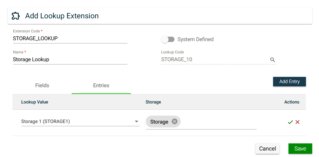
Entries
{% hint style=“danger” %}
To access the Entries tab, a Lookup Code should be selected, and at least one field should be added to the Fields tab.
{% endhint %}
To add an entry for the lookup extension, follow these steps:
Click Add Entry.
Select a valid value for the Fields you have added in the Fields tab.
Select an Element.
Click to save. To cancel adding a new entry, click .
To edit an entry, click . The Lookup Value of existing entries can no longer be changed.
To delete a field, click .
Views
List View
Field
Description
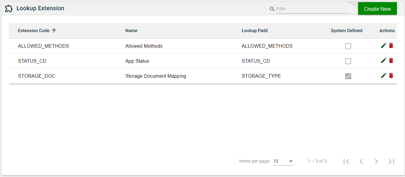
Extension Code
Name of the lookup extension used in the backend.
Name
Label name of the field as displayed in the application.
Lookup Field
Name of the field used in the backend.
System Defined
Indicates if the field is system-defined.
Actions
Displays the following icons:
— Edit icon that allows you to edit the lookup extension details.
— Delete icon that allows you to delete the selected lookup extension.
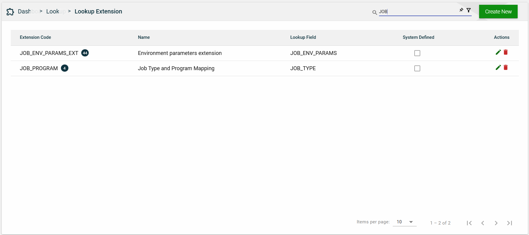
Search
To search for an item on the Lookup Extension page, enter a keyword for an Extension Code or Name.
You can input a valid extension code to search for an item or you can input a partial lookup extension name to search for an item.
Filter
The following filters are available:
Field
Name
Sort
The following columns on the list view can be sorted:
Extension Name
Name
Lookup Field
System Defined
2.3 - Resource Bundle
Overview
Resource bundles are used to render user interface labels, text, and system messages in the user’s preferred language. The application resolves the language dynamically at runtime to ensure that localized content is consistently displayed across all screens.
Language Resolution
When determining which language to use, the system follows a defined fallback order. If a user has explicitly set a preferred language in their profile, that language is applied. If no user-level preference is configured, the system uses the language defined at the organization level. If neither a user-level nor an organization-level language is available, the system defaults to en_US (English – United States) to ensure that a valid language is always used.
Resource Bundle Management
Resource bundles are created and maintained through database queries executed via Flyway migrations. Management of resource bundles through the user interface is not supported. This approach ensures consistency, version control, and traceability of localization changes across deployments.
Scope and Association
Each resource bundle is associated with a specific combination of organization and product. This design allows the same product to support different language configurations across multiple organizations while maintaining isolation between organization-specific customizations.
Access Control
Access to resource bundle–related data is governed by user roles. Business Admin users can view and manage only the products associated with their organization, and the product selection dropdown is limited accordingly. Framework Admin users have visibility across all organizations, and the organization selection dropdown displays all available organizations.
UI Structure
Within the user interface, tabs represent application modules. Each module contains one or more components, and components may further include nested subcomponents. This hierarchical structure determines how resource bundle keys are organized and applied throughout the UI.
Key–Value Mapping
In the application code, resource bundle keys are referenced to retrieve localized content. These keys remain constant and are independent of language. The corresponding values stored in the resource bundles contain the translated text, which is rendered dynamically in the user interface based on the resolved language.
Views
List View
Field
Description
Organization
Name of the organization utilizing the resource bundle.
Product
Name of the product utilizing the resource bundle.
Product Code
Code of the product as configured in the
Products module.
Actions
Displays
that allows you to edit the resource bundle details.
Search
To search for an item on the Resource Bundles page, enter a keyword for an Organization, Product, or Product Code.
For example, you can input the full or partial value of any of the following to search for an item.
Organization name
Product name
Product code
Filter
The following filters are available:
Product Code
Product Name
Sort
The following columns on the list view can be sorted:
Organization
Product
Product Code
2.4 - Business Calendar
Overview
The Business Calendar module enables you to create a calendar that is customized to your business needs. You can personalize the number of workdays or choose a specific day as the work start day. Additionally, you can create a holiday schedule that aligns with your organization’s schedule.
Create a business calendar
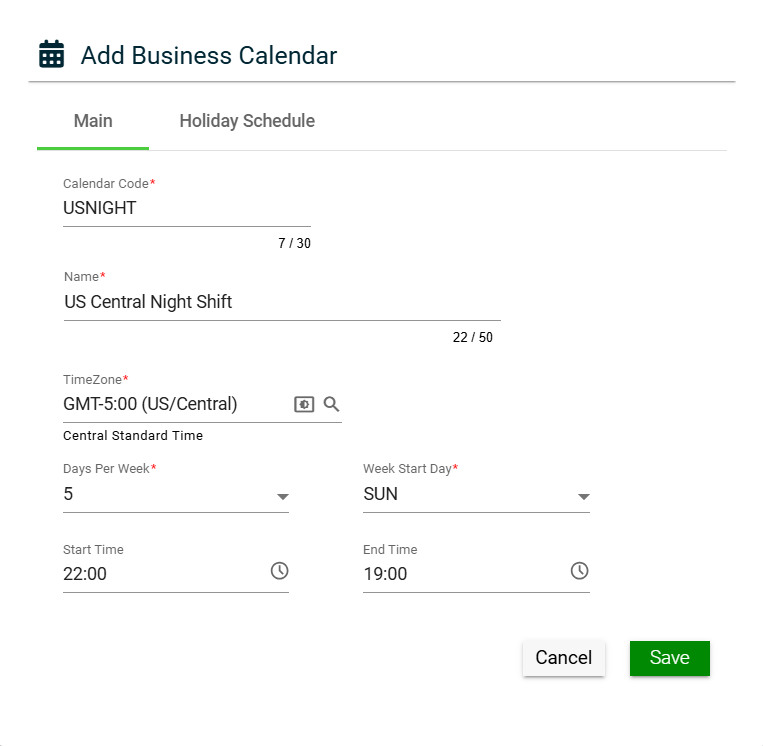
To create a business calendar, click Create New and enter valid values in the following fields:
Main
Field
Description
Calendar Code
Unique identifier of the business calendar.
Name
Name of the calendar.
Days Per Week
Number of workdays per week.
Week Start Day
Start day of the work week.
Start Time
Start time of the work day.
End Time
End time of the work day.
Latest Holiday Year
Indicates the year of the most recent holiday date in the list.
Actions
Displays the following icons:
— Edit icon that allows you to edit the business calendar details.
— Delete icon that allows you to delete the selected business calendar.
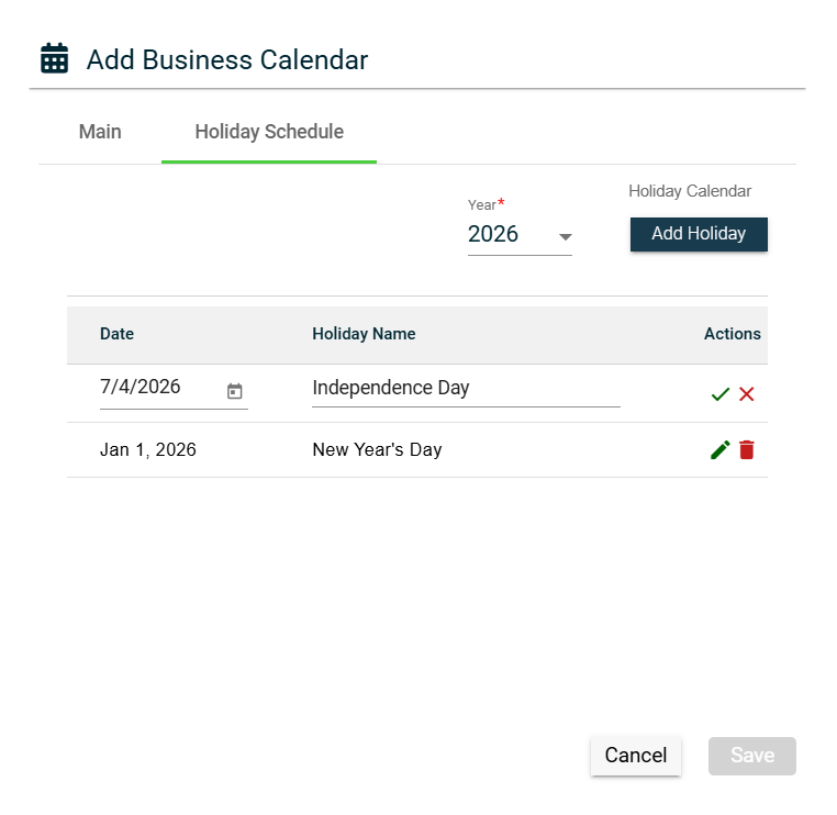
Holiday Schedule
There are two ways to add holidays to your business calendar:
The Holiday Calendar link utilizes a public API that retrieves all the holidays of a particular year for a specific country. To add holidays using this API, follow these steps:
Select a year from the Year dropdown.
Click the Holiday Calendar link.
Select a Country from the Country dropdown list on the Holiday Calendar popup window.
Click Add.
The Holiday Schedule lists all the holidays retrieved by the API. Ensure that you review the list and make the necessary changes before saving.
The list of holidays imported from the Holiday Calendar API doesn’t update automatically if there are any changes in the holiday schedule. To update the list, you can either follow the steps mentioned in the Add a holiday via Holiday Calendar API section again or manually make the necessary changes.
Manually add a holiday
Select a year from the Year dropdown.
Click the Add Holiday button.
Enter the holiday date in the Date field. You can also click the calendar icon to choose the date.
Enter the holiday name in the Holiday Name field.
Click to save. To cancel, click .
Edit a holiday
To edit a holiday in the Holiday Schedule tab, follow these steps:
Click .
Make the necessary changes.
Click to save. To cancel, click .
Delete a holiday
To delete a holiday, follow these steps:
Click .
Click Yes on the confirmation popup window.
To cancel the deletion, click Cancel.
View
List View
Field
Description
Calendar Code
Unique identifier of the business calendar.
Name
Name of the calendar.
Days Per Week
Number of workdays per week.
Week Start Day
Start day of the work week.
Start Time
Start time of the work day.
End Time
End time of the work day.
Latest Holiday Year
Indicates the year of the most recent holiday date in the list.
Actions
Displays the following icons:
— Edit icon that allows you to edit the business calendar details.
— Delete icon that allows you to delete the selected business calendar.
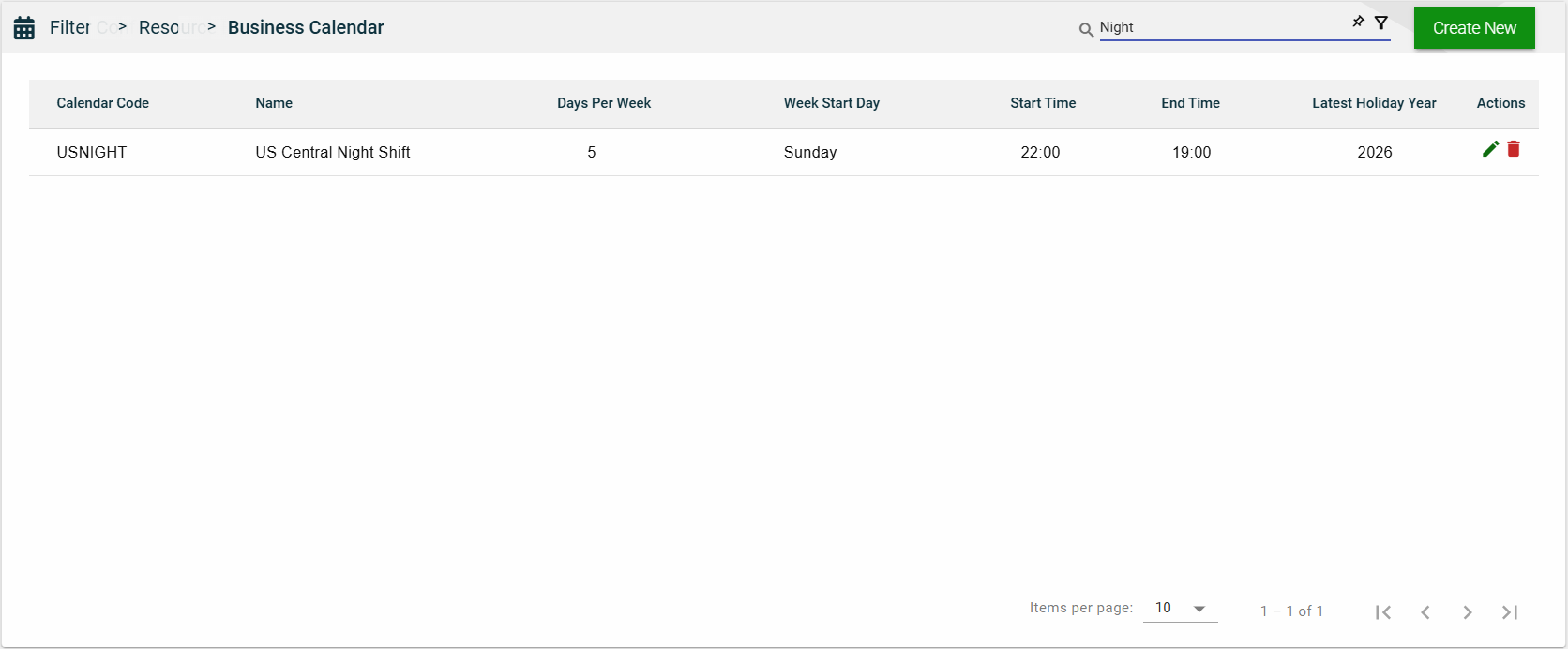
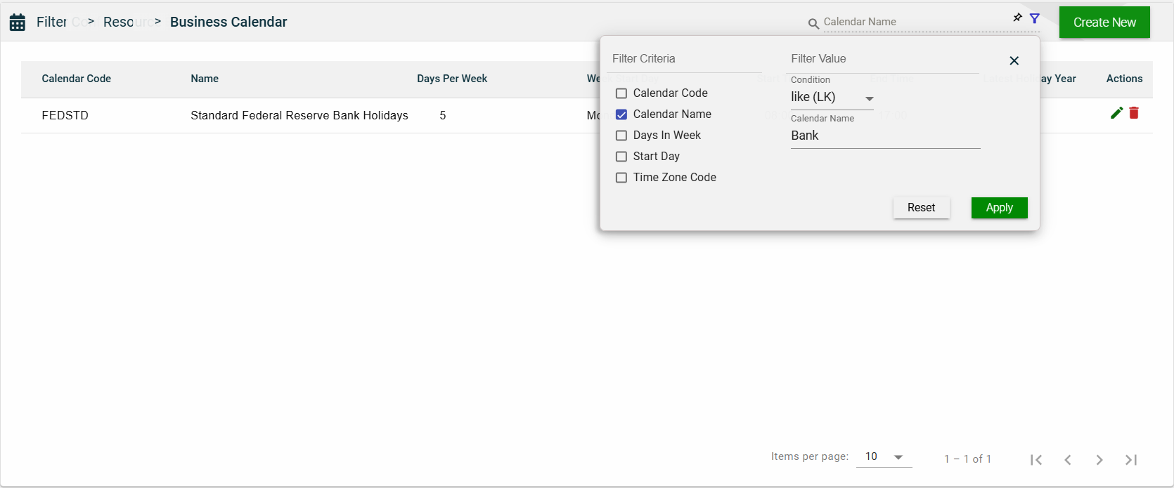
Search
To search for an item on the Business Calendar page, enter a keyword for a Calendar Code or Name.
Filter
The following filters are available:
Calendar Code
Calendar Name
Days In Week
Start Day
Time Zone Code
Sort
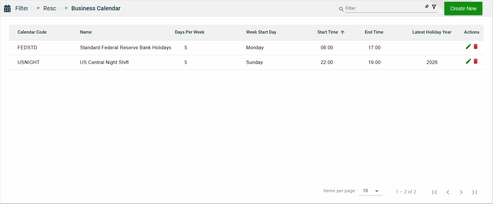
The following columns on the list view can be sorted:
Calendar Code
Name
Days Per Week
Week Start Day
Start Time
End Time
2.5 - Country
Overview
The Country module comprises a pre-built list of countries that can be utilized in your applications. Each country in the list can be customized with its unique address input field labels and date and number formats, which will then become the default for an application that is configured for that particular country.
Create a country
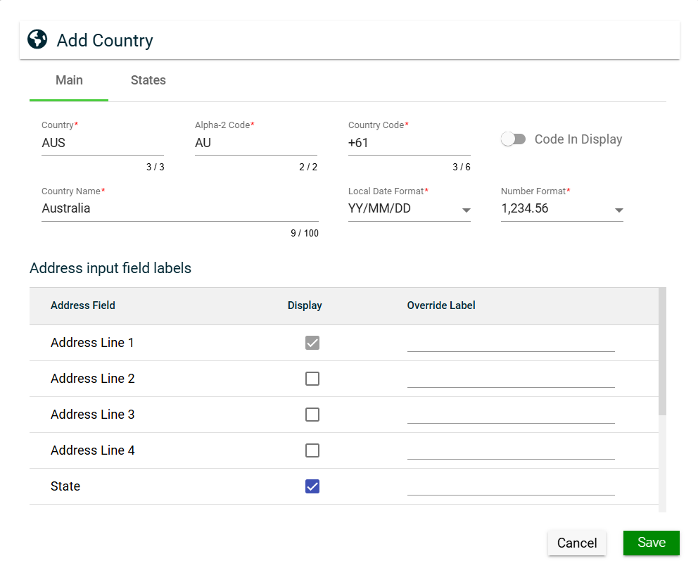
To create a country, click Create New and enter valid values in the following fields:
Main
Field
Description
Country
Three-letter country codes as defined in ISO 3166-1.
Alpha-2 Code
Two-letter country codes as defined in ISO 3166-1.
Country Code
Dialing code of the country that needs to be added as a prefix to make
international calls.
Code In Display
If enabled, the Country Code is displayed in addresses instead of the
Country Name.
Country Name
Name of the country.
Local Date Format
Date format to be used in the system when the country is selected.
Number Format
Numerical format to be used in the system when the country is selected.
Address input field labels
Configurations for the address fields of a country:
Address Field — lists all address fields that can be
included for address input.
Display — if enabled, the specific address field is
included. Otherwise, the address field is hidden.
If you ticked the Display checkbox for
States address field, the States tab is displayed.
Override Label — label that can be used to replace
address field labels in the UI. If not configured, the
Address Field value is displayed.
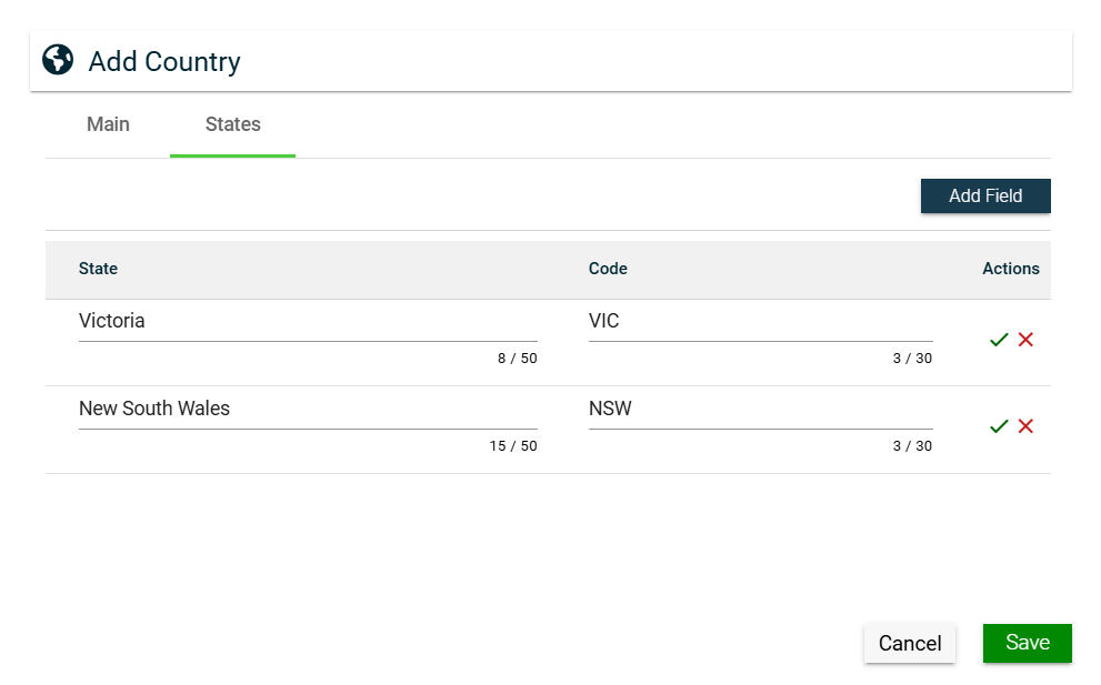
States
The States tab is only displayed when the Display checkbox of the State address field is checked. To add a state, follow these steps:
Click Add Field.
Enter a valid value in the States field.
Enter a valid value in the Code field.
Click to save. To cancel adding a new state, click .
Click Save.
To edit a state, click .
To delete a state, click .
View
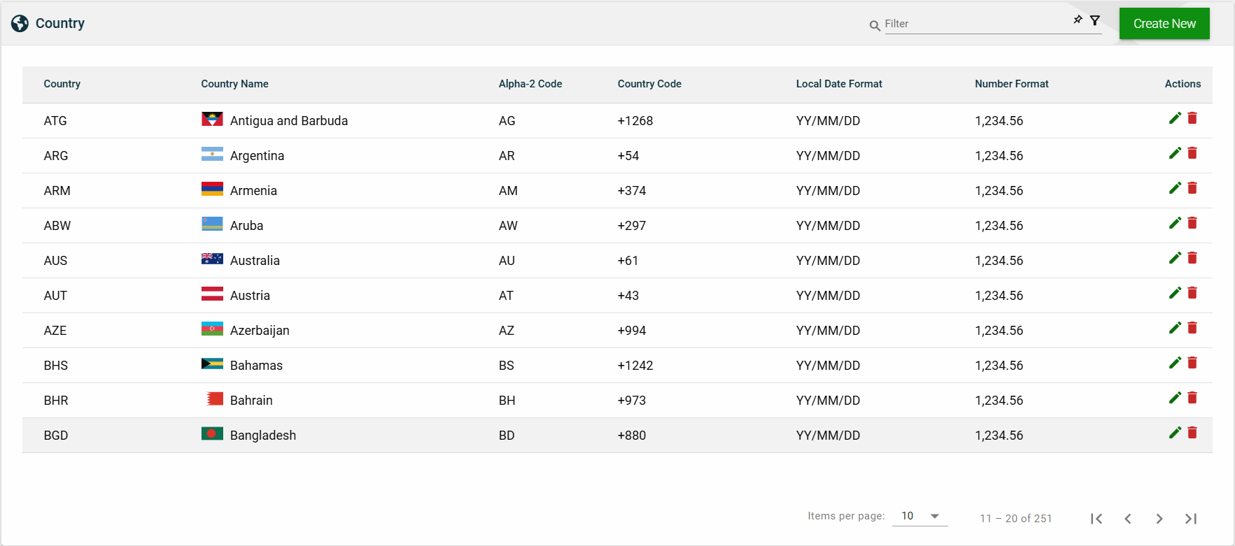
List View
Field
Description
Country
Three-letter country codes as defined in ISO 3166-1.
Country Name
Name of the country.
Alpha-2 Code
Two-letter country codes as defined in ISO 3166-1.
Country Code
Dialing code of the country that needs to be added as a prefix to make
international calls.
Local Date Format
Date format to be used in the system when the country is selected.
Number Format
Numerical format to be used in the system when the country is selected.
Actions
Displays the following icons:
— Edit icon that allows you to edit the country details.
— Delete icon that allows you to delete the selected country.
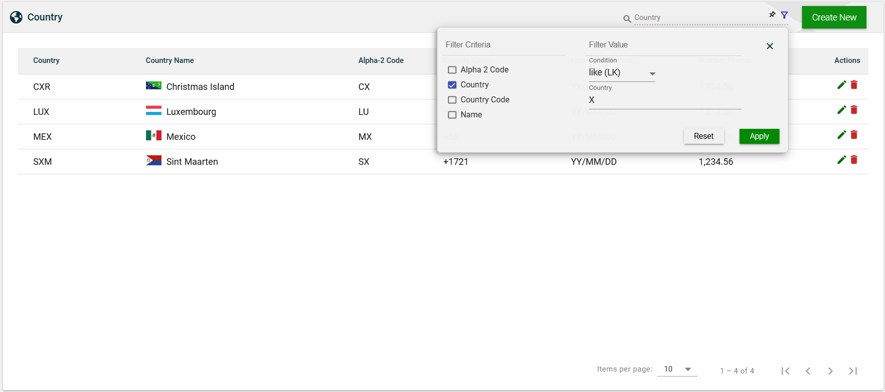
Search
To search for an item on the Country page, enter a keyword for a country name, alpha-3 code, or alpha-2 code.
For example, you can input a valid country name to search for an item or you can input an alpha-2 or alpha-3 code to search for an item.
Filter
The following filters are available:
Alpha 2 Code
Country
Country Code
Name
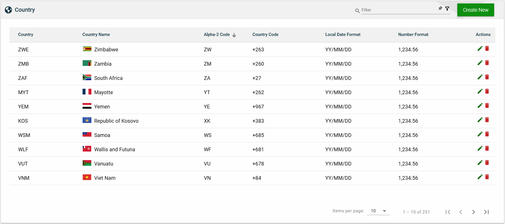
Sort
The following columns on the list view can be sorted:
Country
Country Name
Alpha-2 Code
Country Code
Local Date Format
Number Format
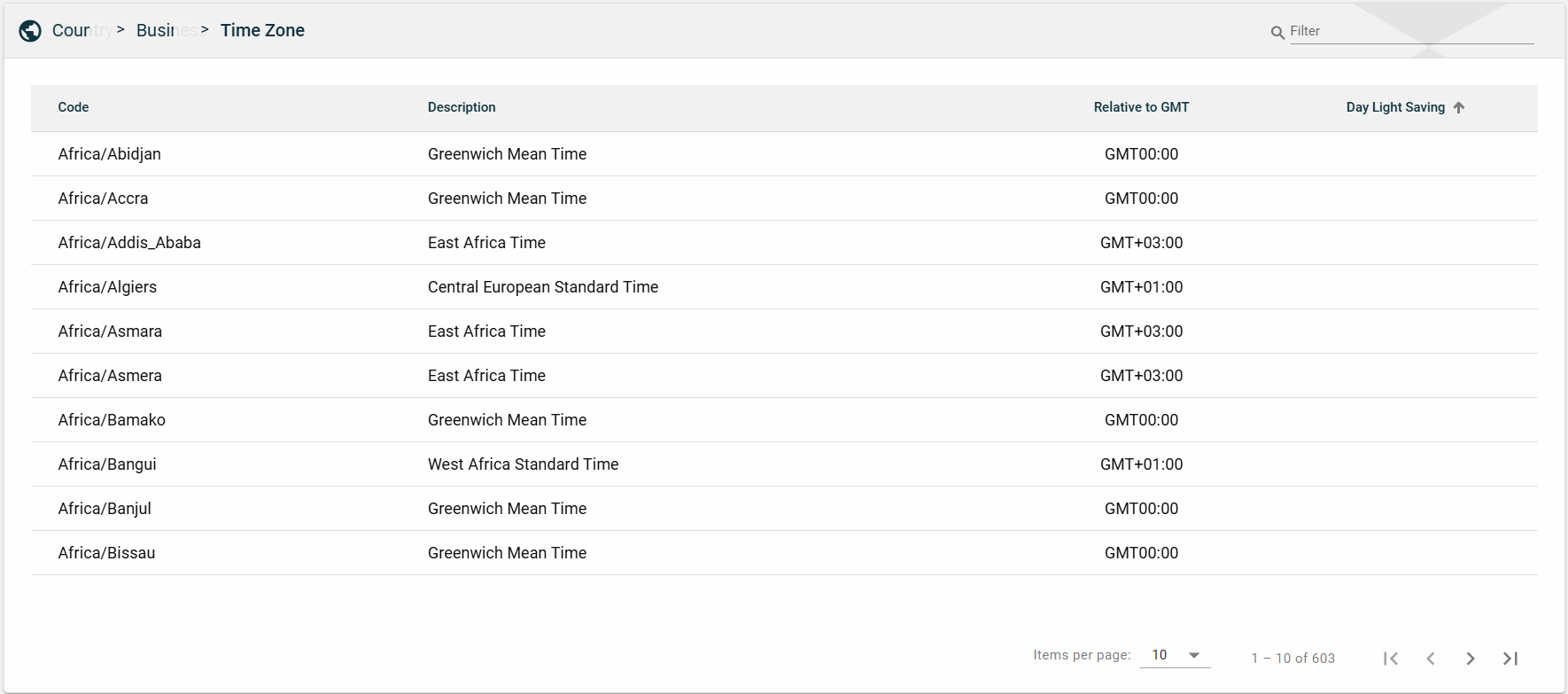
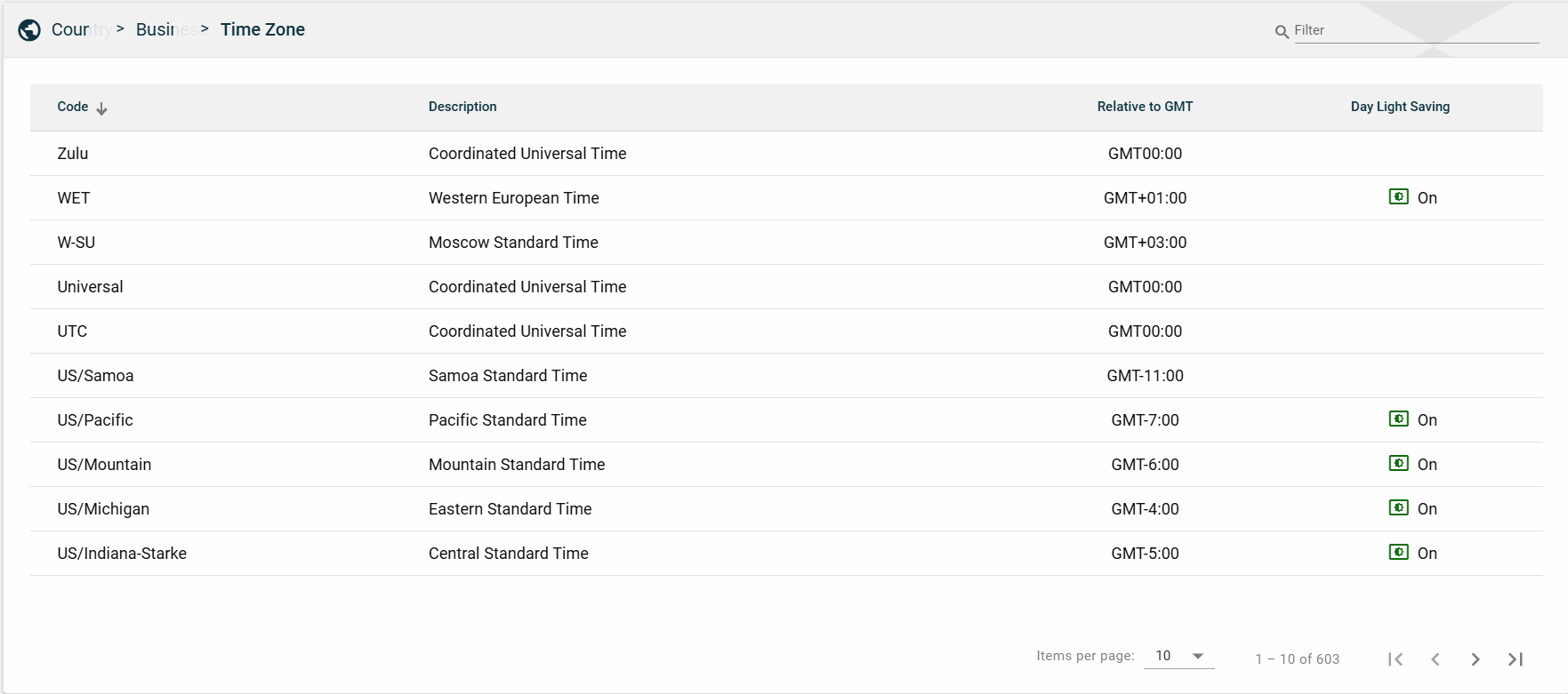
2.6 - Timezone
Overview
The Time Zone module displays an auto-generated list of time zones based on the Greenwich Mean Time (GMT). This module serves only as a repository. You cannot add, edit, or delete a time zone.
Views
List View
Field
Description
Code
Specifies the name of a country along with the continent it is located in,
using the Continent/Country format.
Description
Name of the timezone used in the country.
Relative to GMT
Indicates the time difference between the timezone specified in the
Description column and GMT.
Day Light Saving
Indicates whether the country observes daylight saving.
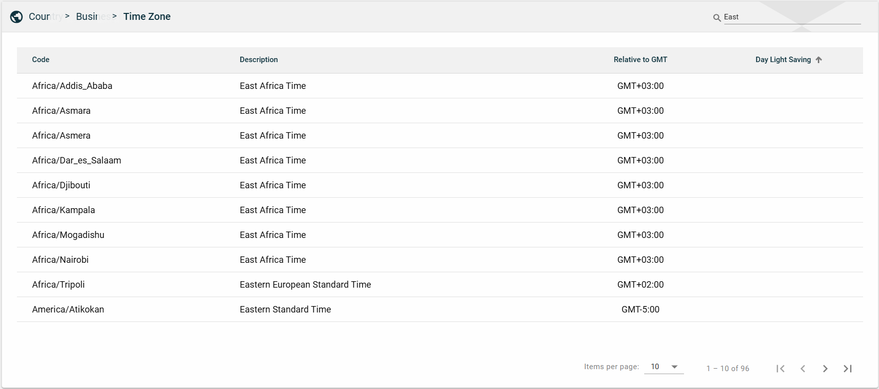
Search
To search for an item on the Time Zone page, enter a keyword for a timezone code or description
You can input a continent or a country to search for a timezone or you can also input a timezone name.
Sort
The following columns on the list view can be sorted:
Code
Description
Day Light Saving
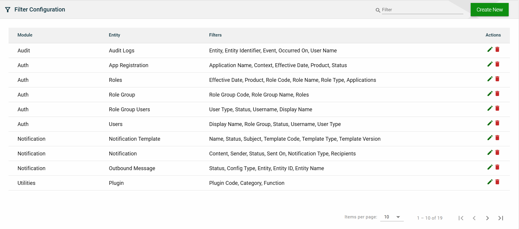
2.7 - Filter Configuration
Overview
The Filter Configuration module is where filter parameters for various modules are managed. This module enables you to customize the filters by adding, modifying, or deleting parameters according to your business needs.
You can use the configured filters to refine the search results in a module by applying filters that meet your search criteria.
Create a filter configuration
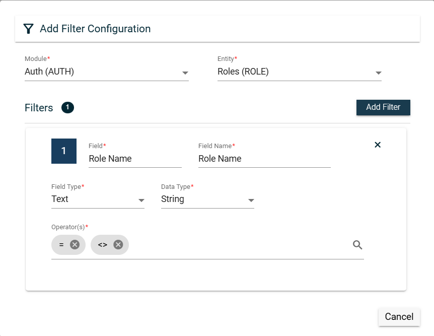
To create a filter configuration, follow these steps:
Click Create New.
Select a module from the Module dropdown list.
Select an entity from the Entity dropdown list. Only entities associated with the selected module are displayed.
Click Add Filter.
Enter a valid Field value.
Enter a valid Field Name value.
Select a type from the Field Type dropdown list.
Date (DATE) — sets the Data Type to Date.
Lookup (LOOKUP) — sets the Data Type to String.
Autocomplete (AUTOCOMP) — sets the Data Type to String.
Boolean (BOOLEAN) — sets the Data Type to String.
Select a single or multiple operators in the Operator(s) dropdown list.
Lookup field type
When creating a filter for a Lookup field type, you can configure the following fields:
Field
Description
View as Autocomplete
Enables the lookup field type to be viewed as an autocomplete field.
Other applicable values besides the default value.
Mandatory: No
Autocomplete field type
When creating a filter for an Autocomplete field type, you can configure the following fields:
Field
Description
HTTP Method
HTTP request method. The possible values are POST or
GET.
Search Url
URL that is accessible to RIA Framework to process the HTTP request.
Autocomplete Code
Code of the autocomplete field.
Autocomplete Description
Description of the autocomplete field.
Autocomplete Code Override
Override value for the autocomplete field.
Default Value
Default value of the selected autocomplete code.
Mandatory: No
Applicable Values
Other applicable values besides the default value.
Mandatory: No
View
List View
Field
Description
Module
Module when the Entity belongs to.
Entity
Entity in the RIA Framework where the filters can be applied.
Filters
Lists all the fields in the Entity that can be used as filters.
Actions
Displays the following icons:
— Edit icon that allows you to edit the filter configuration details.
— Delete icon that allows you to delete the selected filter configuration.
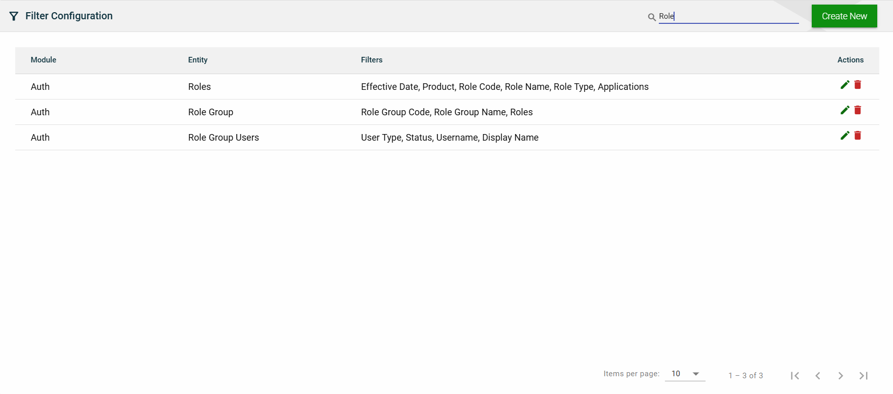
Search
To search for an item on the Filter Configuration page, enter a keyword for a module or entity.
You can input a valid module name or a valid entity name to filter the list.
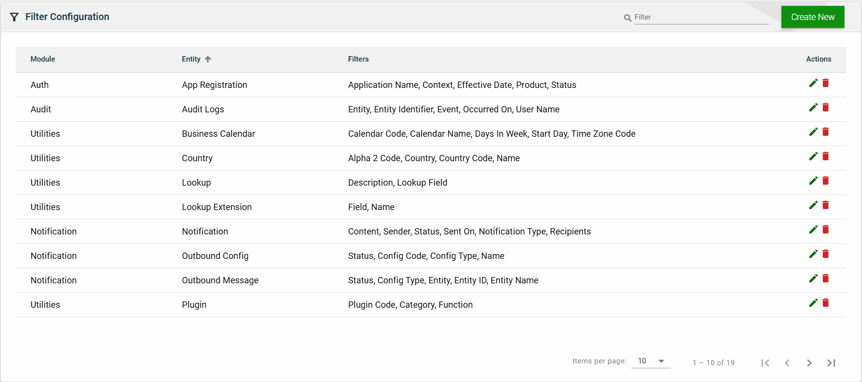
Sort
The following columns on the list view can be sorted:
Module
Entity
2.8 - Attributes
Overview
Create an attribute
To create an attribute, click Create New and enter valid values in the following fields:
Main
Field
Description
Attribute Field
Attribute field to be added to store your organization-specific information related to entities.
Data Type
Type of the information to be stored. The following are the possible values:
Date (DTE)
Number (NBR)
String (STR)
Description
Description of the additional attribute field.
System Defined
Enabling the flag indicates that the value is delivered as a part of the application to support a specific business workflow.
Predefined List
Enabling the flag will require users to add a list of values applicable to the attribute. If attribute is linked to a variant, the values will be synchronized from the variant.
Required
This indicates that the attribute is mandatory for the entity(s) in context, as a part of its definition.
Entity(s)
The applicable entity(s) in the system for which the add-on field in context is applicable to.
Attribute Values
The States tab will only be enabled if there are any states associated with the selected country. Otherwise, it will remain disabled.
The States tab also automatically captures all states. You can also add, edit, or delete a state if necessary.
View
List View
Field
Description
Attribute
Attribute field to be added to store your organization-specific information related to entities.
Description
Description of the additional attribute field.
Entity(s)
The applicable entity(s) in the system for which the add-on field in context is applicable to.
Data Type
Type of the information to be stored. The following are the possible values:
Date (DTE)
Number (NBR)
String (STR)
System Defined
If checked, this means that the attribute value is delivered as a part of the application to support a specific business workflow.
Predefined List
If checked, this means that you have defined a list of acceptable values for the attribute.
Required
If checked, this means that the attribute is mandatory for the entity(s).
Actions
Displays the following icons:
— Edit icon that allows you to edit the attribute details.
— Delete icon that allows you to delete the selected attribute.
Search
To search for an item on the Country page, enter a keyword for an attribute name or description.
For example, you can input a valid attribute name to filter the list.
<add screenshot>
You can also input a partial description to filter the list.
<add screenshot>
Sort
The following columns on the list view can be sorted:
Attribute
<add screenshot>
Description
<add screenshot>
Data Type
<add screenshot>
System Defined
<add screenshot>
Predefined
<add screenshot>
Required
<add screenshot>
3 - System Configuration
3.1 - Notification Templates
Overview
The Notification Templates module allows you to create and manage standardized templates for sending notifications. This module offers a range of features, such as the following:
Logos and branding images
Various fonts and sizes
Word stylings
Variables
Recipient behavior configuration
Option to store sent notifications
If you need to configure an alert template, kindly refer to the Resource Bundle module.
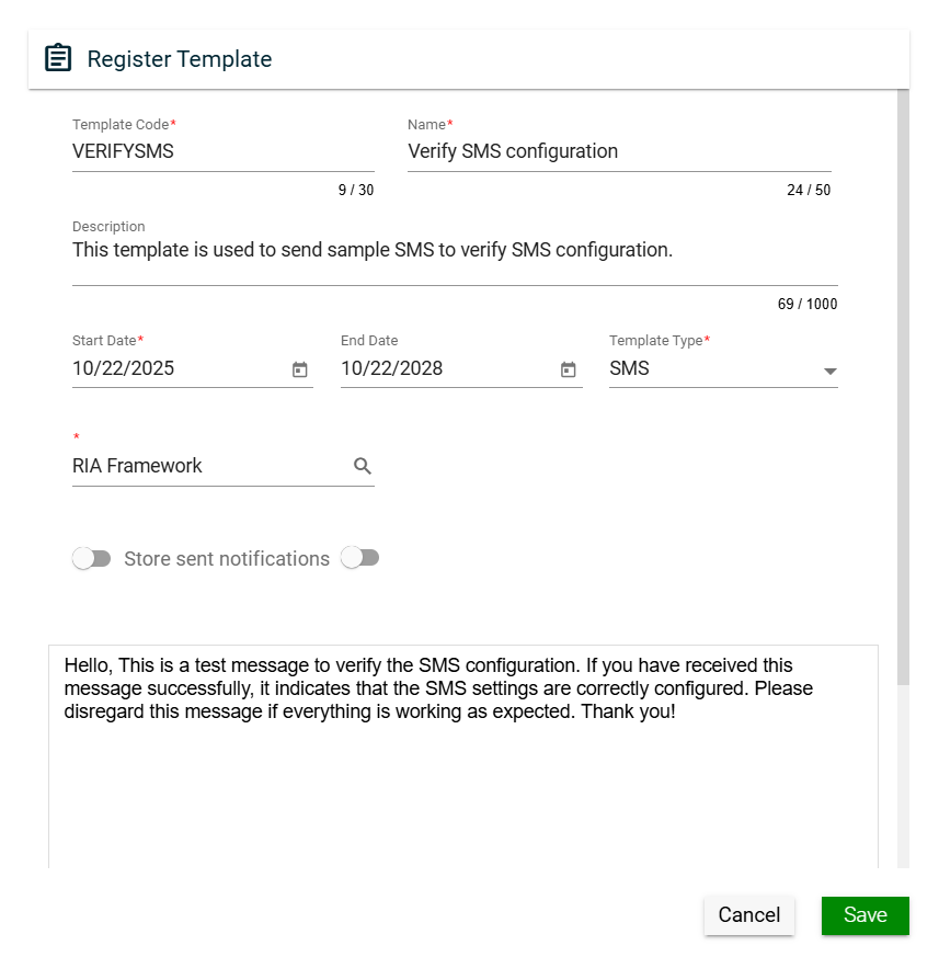
Create a template
To create a template, click the Create New button and enter valid values in the following fields:
Field
Description
Template Code
Code of the template.
Mandatory: Yes
Name
Name of the template.
Mandatory: Yes
Subject
Subject of the notification message.
For example, when sending an email using a template, the configured subject is the text that appears as the title of the email in the recipient's inbox.
Mandatory: Yes
Description
Description of the template.
Mandatory: No
Effective Date
Date when the template will be available for use.
Mandatory: Yes
Expiration Date
Date when the workflow model will no longer be available.
Mandatory: No
Template Type
Type of the template.
Mandatory: Yes
Recipient Behavior
Way the notification will be sent. The following are the possible values:
Send as BCC recipients
Send as TO recipients
Send Individual Notifications
Mandatory: No
Store sent notifications
Allows you to store notifications that have been sent using the template.
The list of sent notifications can be found in the Notifications page.
Default: Enabled
Mandatory: No
Set wait period
Allows you to set the wait period for the notification email to be sent. Only one email will be sent per recipient over the specified time.
You have to specify the wait period by entering values in one or more of the following fields:
Days
Hrs
Mins
Default: Disabled
Mandatory: No
Body
Allows you to enter and customize your notification message.
Mandatory: No
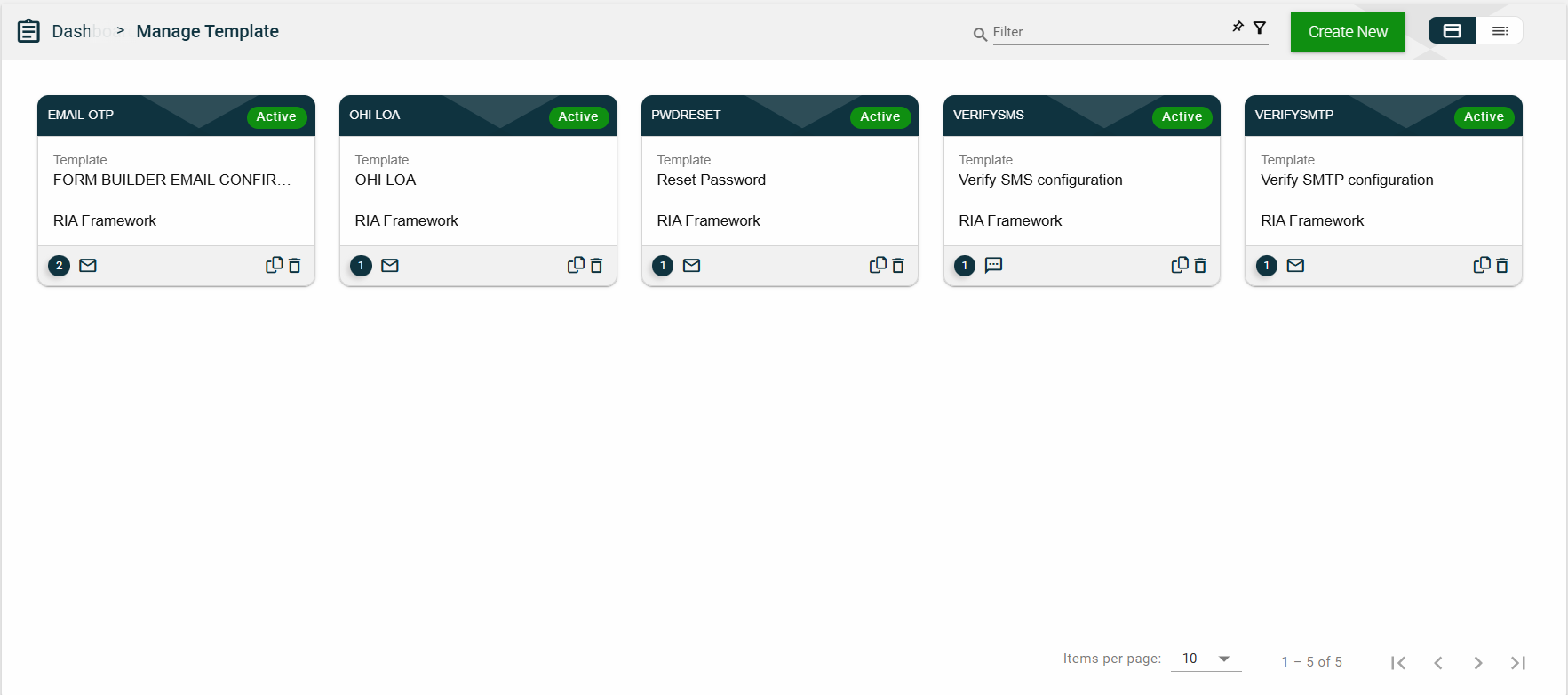
Views
Card View
The card view presents all applications in the form of cards, with the Template Code on the card header. The card displays the Template Name and Effective Date. The card footer displays a number of versions, an email icon, a duplicate icon, and a delete icon.
Clicking anywhere on the card, except the duplicate and trash icons, will redirect you to view the organization details.
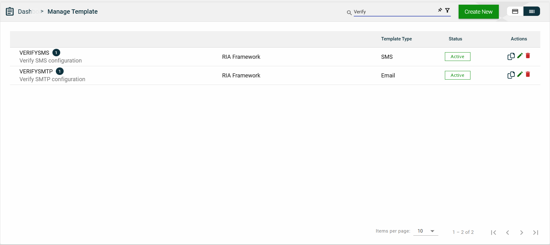
List View
The list view displays all Environments in a table format.
Column Name
Description
Template Code
Code of the template.
The number beside it represents the number of template versions.
Name
Name of the template.
Template Type
Type of the template.
Status
Status of the template. The following are the possible values:
Active
Inactive
Actions
Displays the following icons:
— Clone icon that allows you to clone the selected dataset. When clicked, a popup window is displayed asking you to provide a new Template Code, Name, and Subject. All other configurations of the selected dataset are copied.
— Edit icon that allows you to edit the product details.
— Delete icon that allows you to delete the selected dataset.
Search
To search for a template, enter a partial or a ful template name.
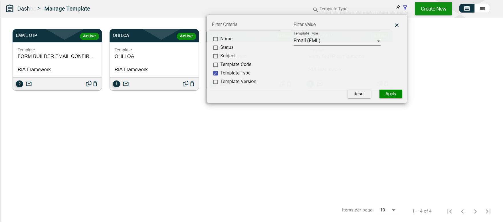
Filter
The following filters are available on both card and list views:
Name
Status
Subject
Template Code
Template Type
Template Version
Sort
The following columns on the list view can be sorted:
Template Code
Name
Template Type
Status
3.2 - Alert Types
Alert types categorize different types of notifications or warnings that are triggered within a system. These can range from informational alerts to critical error warnings, each serving a specific purpose. Properly defining and managing alert types ensures users receive timely and relevant information based on the severity of the situation.
Create an alert type
Main
Field
Description
Alert Type
Type of the alert.
Name
Name of the alert.
Description
Description of the alert.
Alert Template
Select from the list of all available alert templates.
Email Template
Select from the list of all available email templates.
Allow User Preferences
Enables you to customize your alert preferences.
Criteria
You cannot add a criterion until all mandatory fields in the Main tab are completed.
To create a criterion, follow these steps:
Click Add Criterion.
Enter a valid name in the Criteria field.
Select a type from the Field Type dropdown list.
Date — sets the Data Type to Date.
Lookup — sets the Data Type to String. If you selected Lookup, additional fields are displayed. See Lookup field type.
Autocomplete — sets the Data Type to String. If you selected Autocomplete, additional fields are displayed. See Autocomplete field type.
Boolean — sets the Data Type to String.
Select a single or multiple operators in the Operator(s) dropdown list.
Click the icon to close the criteria window.
Lookup field type
When creating a criterion for a Lookup field type, you can configure the following fields:
Field
Description
View as Autocomplete
Enables the lookup field type to be viewed as an autocomplete field.
Default: Disabled
Mandatory: No
Lookup Code
Code of the lookup.
Mandatory: Yes
Autocomplete field type
When creating a criterion for an Autocomplete field type, you can configure the following fields:
Field
Description
HTTP Method
Dropdown list of supported HTTP methods for API calls.
POST
GET
Search URL
URL that is accessible to the Ocular, from which it calls the API to retrieve the necessary data.
Autocomplete Code
Unique code used to identify the autocomplete configuration in the system.
Autocomplete Description
Description of the autocomplete field.
Autocomplete Code Override
Overrides the default autocomplete code with a custom one if needed.
After creating, click the button to close the criterion window and return to the list of criteria.
To view the criteria details again, click on any field on the list.
To delete a criteria, click .
Entries
You cannot add an entry until all mandatory fields in the Main tab are completed.
To create an entry, follow these steps:
Enable the Criteria specific templates toggle.
Click Add Entry.
Select a template from the Email Template dropdown list.
Select a template from the Alert Template dropdown list.
If you have added criteria in the Criteria tab, ensure that you fill these out with valid data.
Click to save.
To edit an entry, click .
To cancel the edit, click .
To delete an entry, click .
Views
List View
The alert types and their details are displayed in a tabular format.
Field
Description
Type
Type of the alert. Under it, the alert name is displayed.
Alert Template
Template code of the alert. Under it, the alert template description is displayed.
Email Template
Template code of the email. Under it, the email template description is displayed.
Criteria Count
Indicates the number of criteria added to the alert.
Actions
Displays the following icons:
— Edit icon that allows you to edit the selected alert type. You can edit any field except the Alert Type.
— Delete icon that allows you to delete the selected alert type.
Search
For example, if you input a keyword or the full name of an alert type, only the matching items are displayed.
Sort
The following columns on the list view can be sorted:
Type
Alert Template
Email Template
3.3 - Alert Settings
Alert Settings
Overview
Views
List View
The notifications and their details are displayed in a tabular format.
 .
.
 .
.
 and make the necessary changes.
 .
.
 — Clone icon that allows you to clone the selected dataset. When clicked, a popup window is displayed asking you to provide a new Application Name and Application Context. All other configurations of the selected dataset are copied.
 — Clone icon that allows you to clone the selected dataset. When clicked, a popup window is displayed asking you to provide a new Product Code, Product Name, and Landing Page.


 icon.
icon. .
.


 icon to close the criteria window.
 to save.