Products
Overview
A product is a collection of multiple interconnected microservices or Applications that work together to provide an integrated business solution.
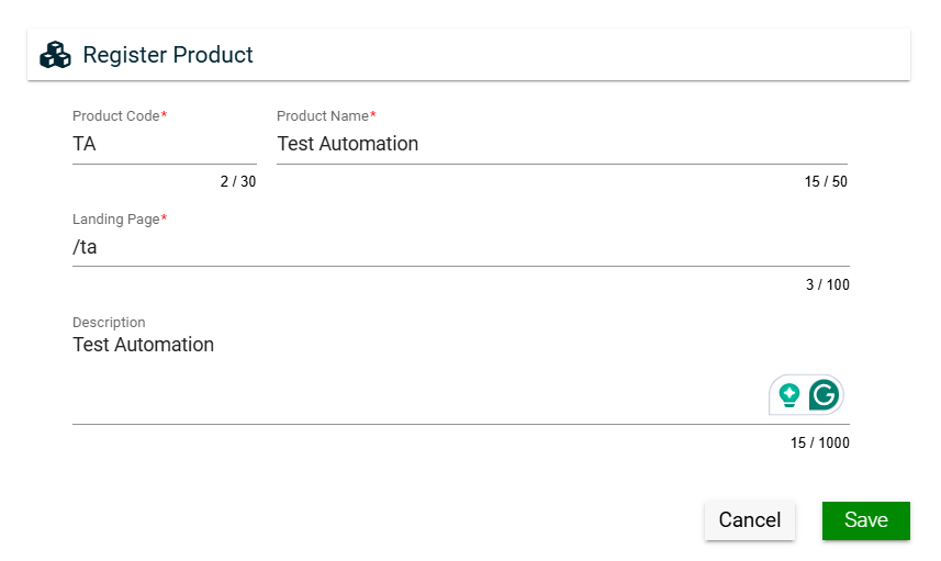
Create a product
To create a product, click Create New and enter valid values in the following fields:
| Field | Description |
|---|---|
| Product Code |
Code of the product. |
| Product Name |
Name of the product. |
| Landing Page |
URL of the first page the user will see when the application is loaded. |
| Description |
Additional details of the product. |
Views
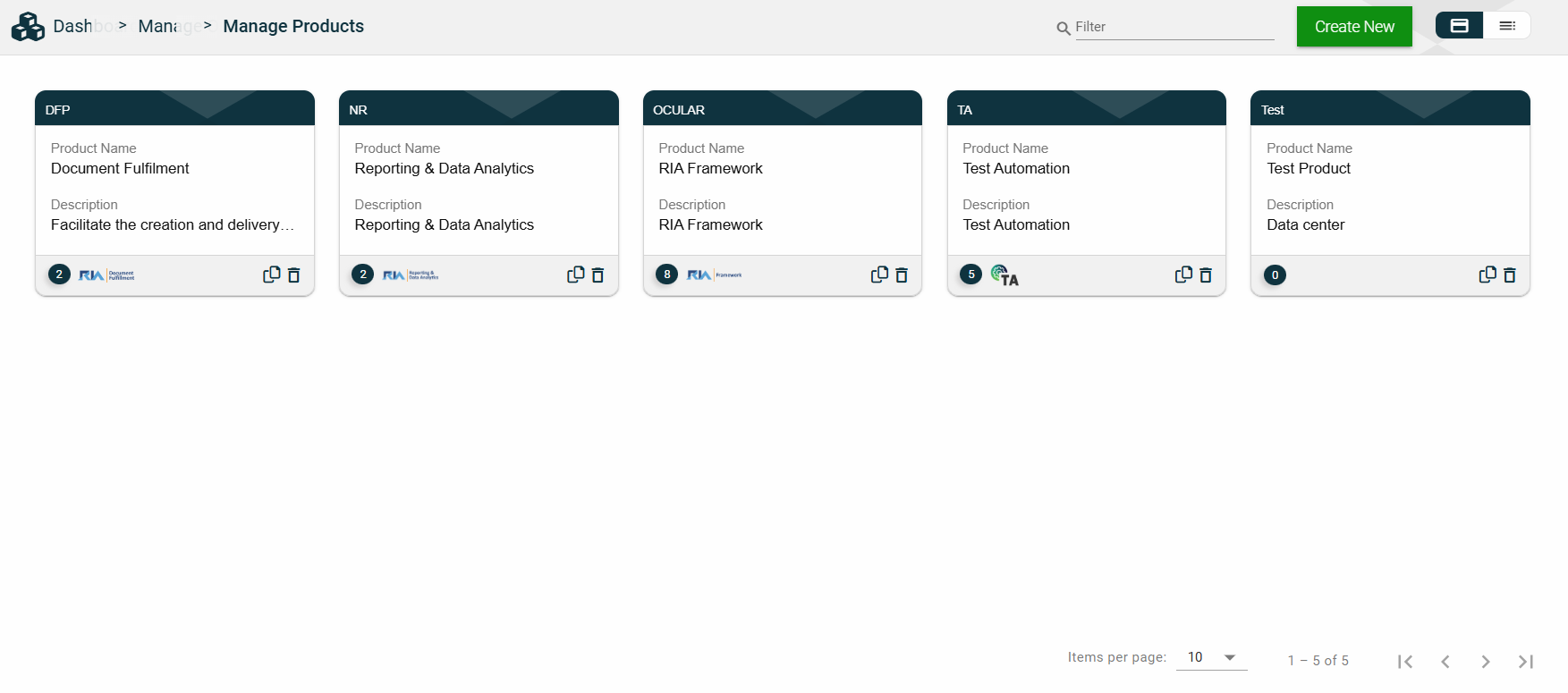
Card View
The card view presents all applications in the form of cards, with the product code on the card header. The card displays the Product Name and Description. The card footer displays the number of applications associated with the product, the product logo, a duplicate icon, and a delete icon.
Clicking anywhere on the card, except the duplicate and trash icons, will redirect you to view the Product Details.
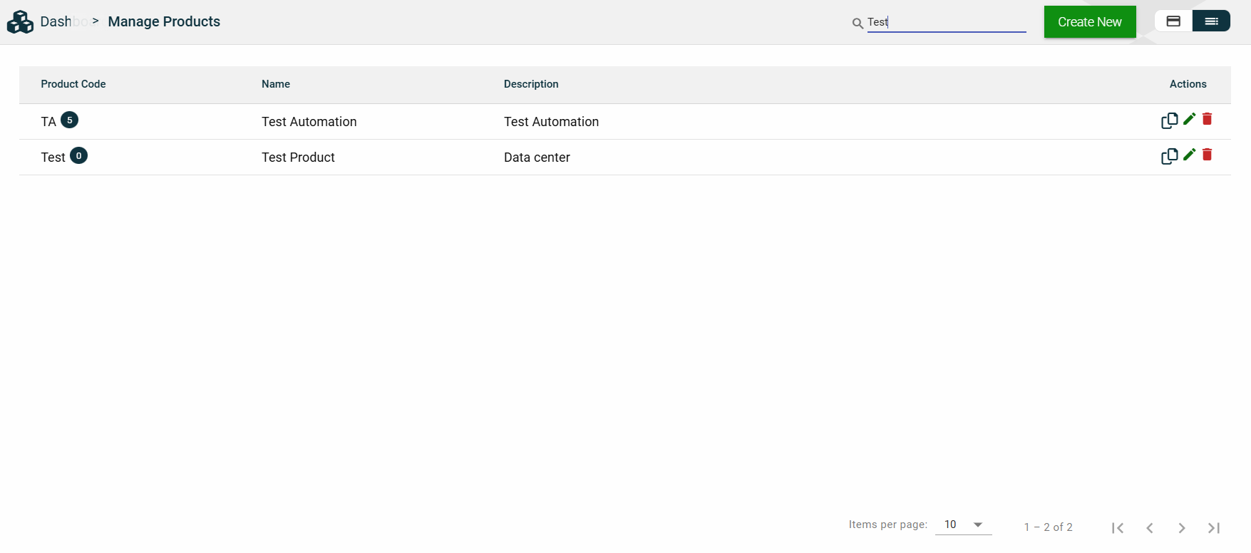
List View
The list view displays all products in a table format, listing all the configured products in the framework.
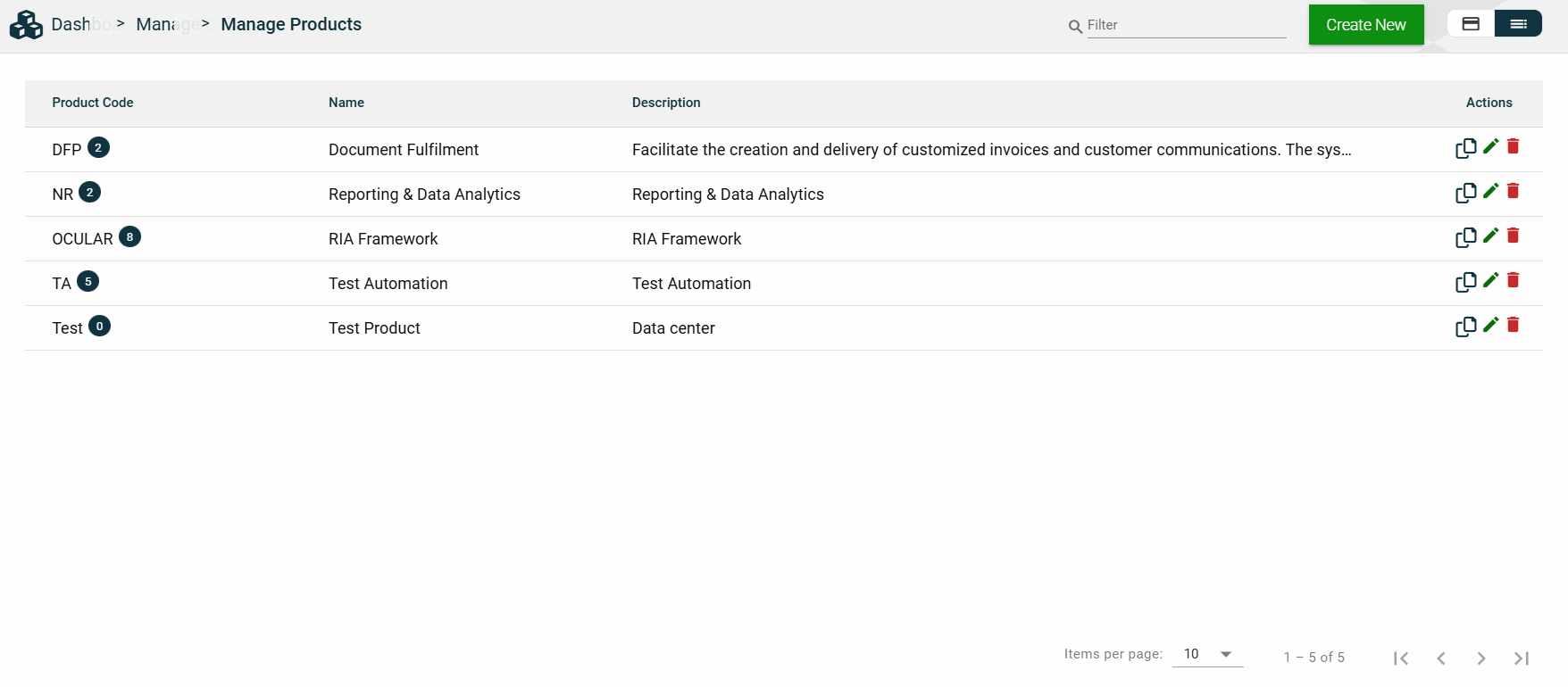
| Column Name | Description |
|---|---|
| Product Code | Code of the product. It also displays the number of applications associated with the product. |
| Name | Name of the product. |
| Description | Additional details of the product. |
| Actions |
Displays the following icons:
|
 — Clone icon that allows you to clone the selected dataset. When clicked, a popup window is displayed asking you to provide a new Product Code, Product Name, and Landing Page.
 — Edit icon that allows you to edit the product details.
 — Delete icon that allows you to delete the selected product.
Filter
You can filter or search for products by entering a partial or full product code or organization name. For example:
Sort
The following columns on the list view can be sorted:
- Product Code
- Name
- Description
Product Details
Product Details
The Product Details tab shows all the information you added when creating a product. For more information about the fields, see Create a product.
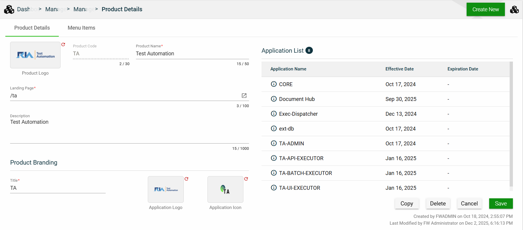
This tab also lists all applications making up the selected product. To view the application details, click on the Application Name hyperlink.
This tab allows you to update all the fields except for the Product Code. Additionally, you can choose to copy or delete the selected product.
Menu Items
The Menu Items tab displays the left navigation menu items of your product. While you cannot add or delete a menu item, you can configure the following options for a menu item:
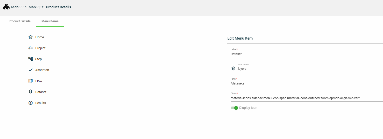
| Field | Description |
|---|---|
| Label | Display name of the menu item. |
| Icon name | Name of the icon displayed beside the Label. |
| Path | Location path that is loaded when the menu item is clicked. |
| Class | Class idenitifying the group and style of elements. |
| Display icon | Enables you to display or hide the icon beside the Label. |